# A tibble: 8,345 × 18
   ID        Language_ID Parameter_ID Value Code_ID Comment Source codeReference
   <chr>     <chr>       <chr>        <chr> <chr>   <chr>   <chr>  <lgl>
 1 kolp1236… kolp1236    aes          3     aes-sh… Kol (1… hh:he… NA
 2 tana1288… tana1288    aes          3     aes-sh… Tanahm… hh:he… NA
 3 touo1238… touo1238    aes          3     aes-sh… Touo (… hh:he… NA
 4 bert1248… bert1248    aes          3     aes-sh… Fadash… hh:he… NA
 5 sius1254… sius1254    aes          6     aes-ex… Siusla… hh:he… NA
 6 cent2045… cent2045    aes          6     aes-ex… Jalaa … <NA>   NA
 7 else1239… else1239    aes          3     aes-sh… Elseng… hh:he… NA
 8 taia1239… taia1239    aes          4     aes-mo… Taiap … hh:he… NA
 9 pyuu1245… pyuu1245    aes          3     aes-sh… Pyu (4… hh:he… NA
10 mato1253… mato1253    aes          6     aes-ex… Arára … hh:he… NA
# ℹ 8,335 more rows
# ℹ 10 more variables: status <fct>, Name <chr>, Macroarea <chr>,
#   Latitude <dbl>, Longitude <dbl>, Glottocode <chr>, ISO639P3code <chr>,
# Countries <chr>, Family_ID <chr>, Language_ID.y <chr>Data Analysis for LEL - Week 4
Data viz
University of Edinburgh
Good data visualisation
Alberto Cairo has identified four common features of good data visualisation (Spiegelhalter 2019:64–66):
It contains reliable information.
The design has been chosen so that relevant patterns become noticeable.
It is presented in an attractive manner, but appearance should not get in the way of honesty, clarity and depth.
When appropriate, it is organized in a way that enables some exploration.
Endangerment status
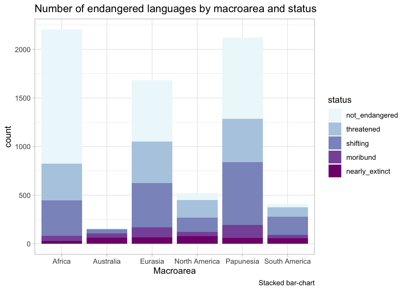
Information is (not) reliable
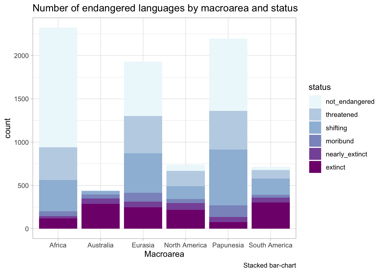
Information is reliable
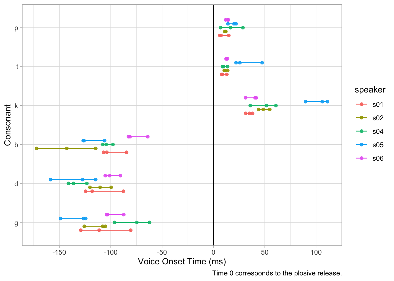
Patterns are (not) noticeable
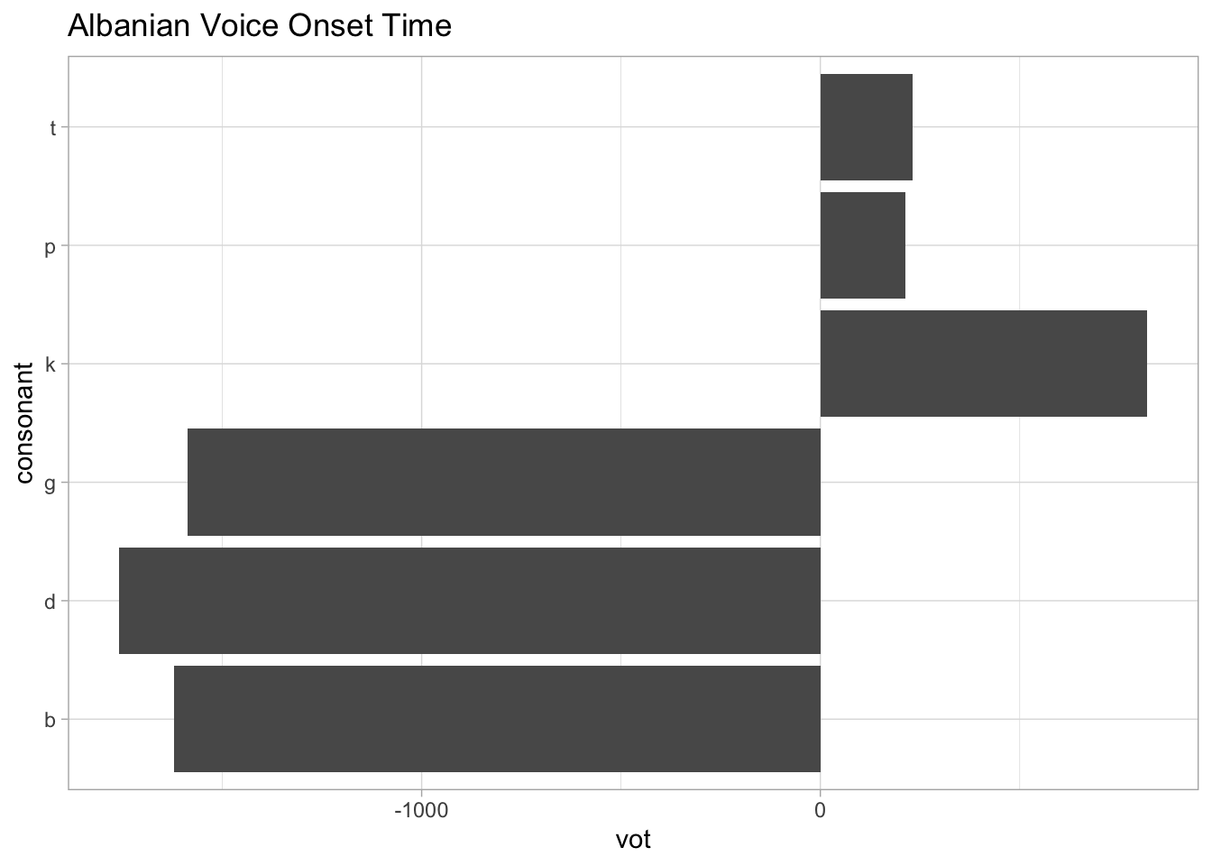
Patterns are noticeable
Aesthetics (should not) get in the way
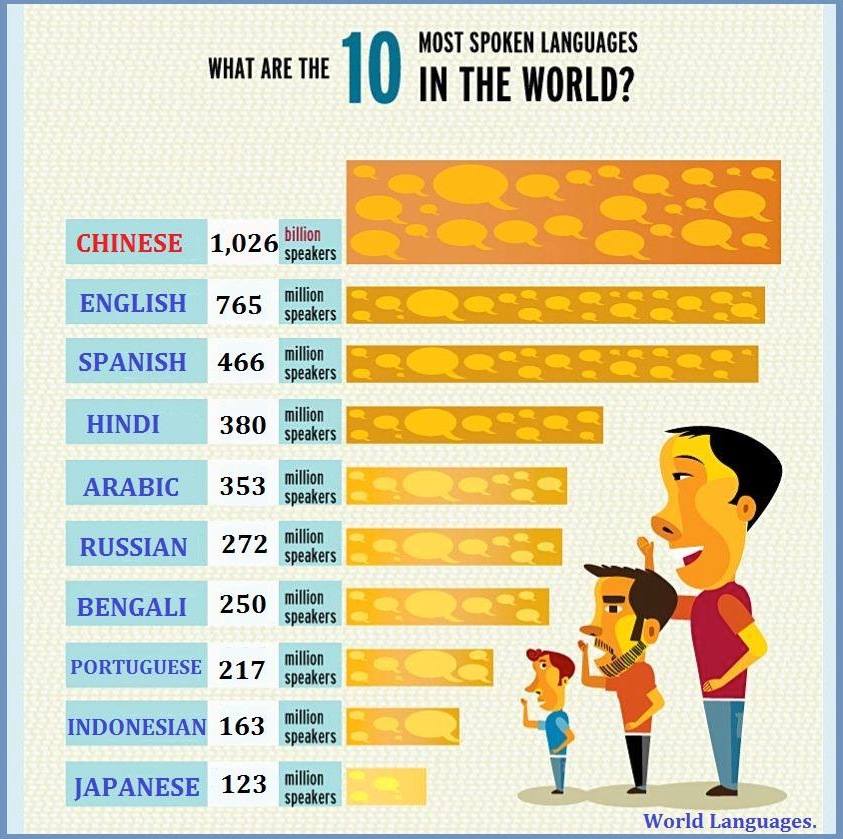
Image source. See more examples on Ugly Charts.
(Does not) enable exploration

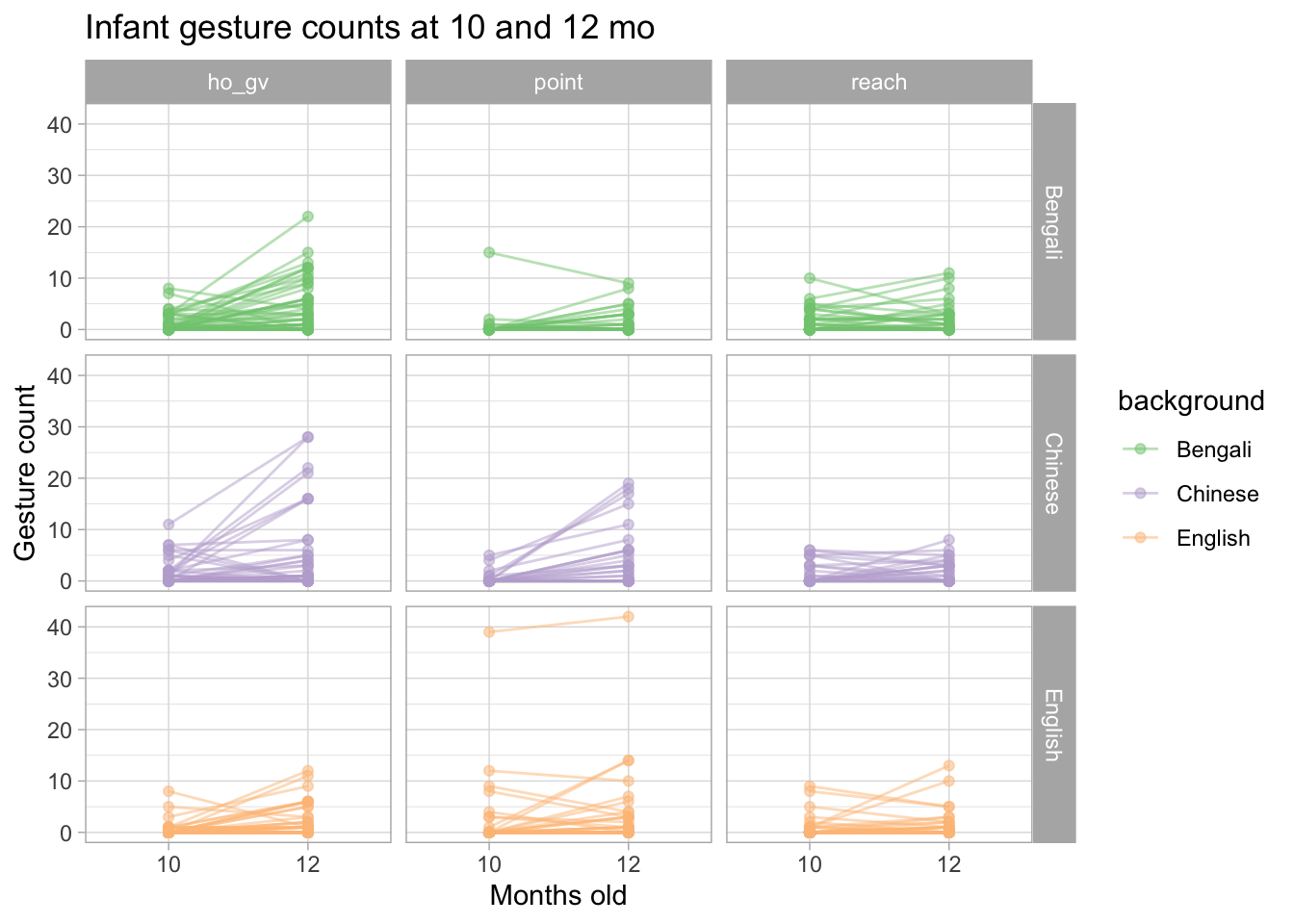
Enables exploration
Practical tips
Show raw data (e.g. individual observations, participants, items…).
Separate data in different panels as needed.
Use simple but informative labels for axes, panels, etc…
Use colour as a visual aid, not just for aesthetics.
Reuse labels, colours, shapes throughout different plots to indicate the same thing.
Activity
Form small groups and discuss:
Go to Ugly Charts, pick a couple charts to discuss.
Discuss the plots in a couple recent papers you have read.