Data Analysis for LEL - Week 8
Advanced plotting
University of Edinburgh
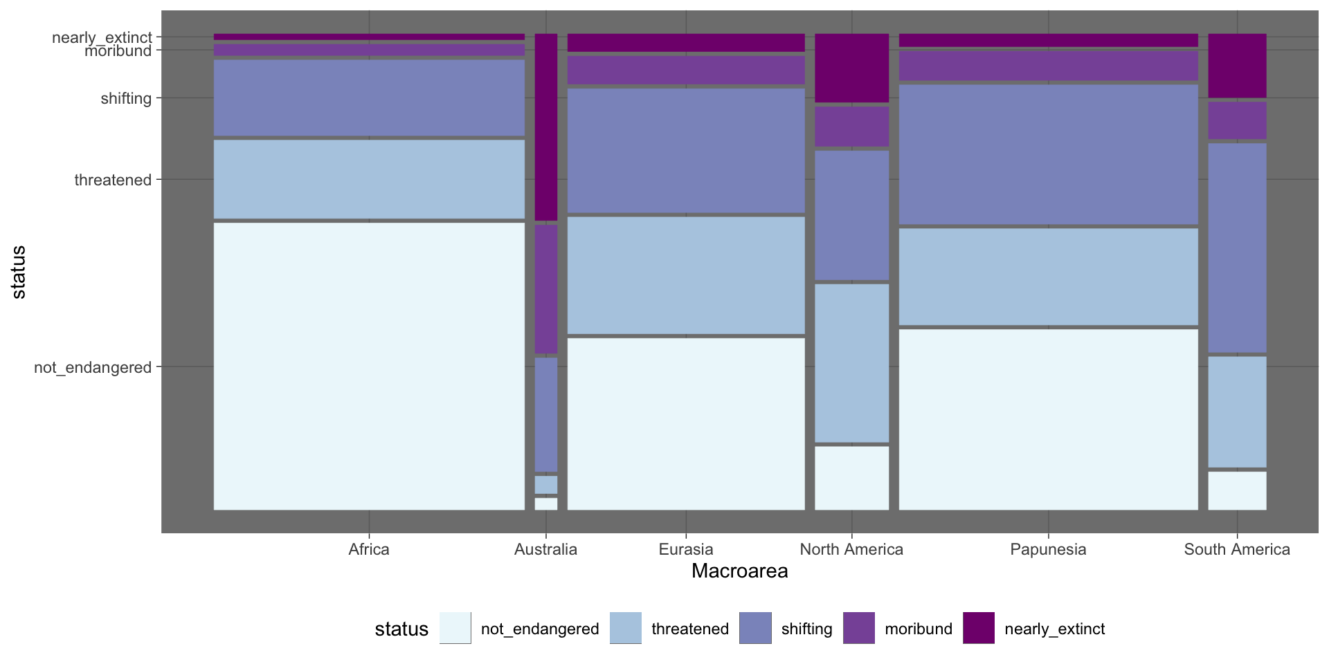
Mosaic plot
Mosaic plot
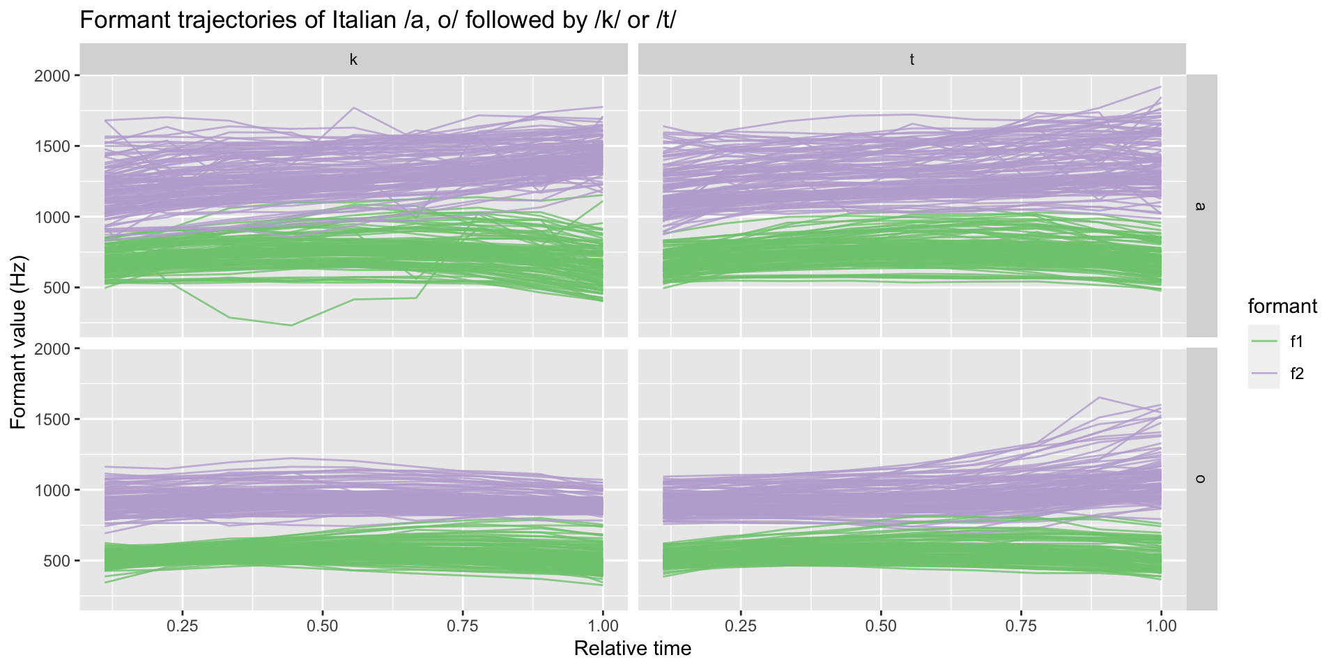
Line plot
formants %>%
  filter(c2 %in% c("t", "k")) |>
  filter(vowel %in% c("a", "o")) |>
  ggplot(aes(time, value, group = id, colour = formant)) +
  geom_line(alpha = 0.8) +
  facet_grid(cols = vars(c2), rows = vars(vowel)) +
  scale_color_brewer(type = "qual") +
  labs(
    x = "Relative time", y = "Formant value (Hz)",
    title = "Formant trajectories of Italian /a, o/ followed by /k/ or /t/"
  )
Line plot
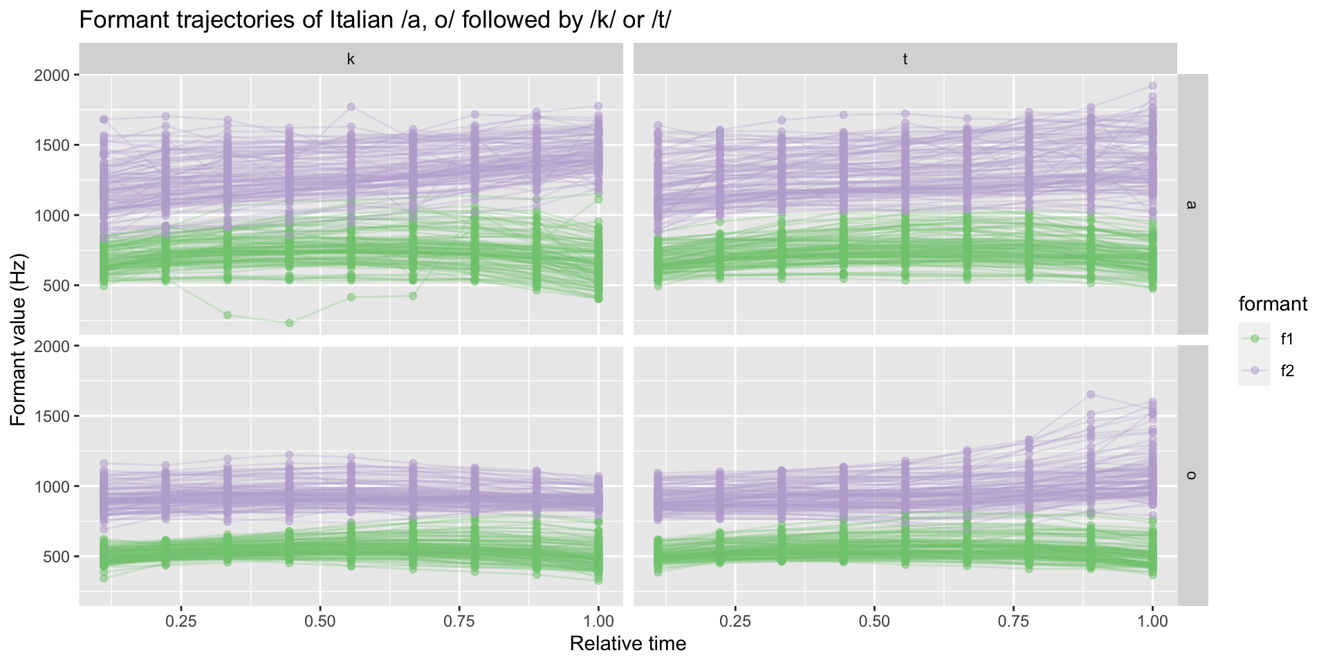
Line plot with points
formants %>%
  filter(c2 %in% c("t", "k")) |>
  filter(vowel %in% c("a", "o")) |>
  ggplot(aes(time, value, group = id,
             colour = formant)) +
  geom_line(alpha = 0.25) +
  geom_point(alpha = 0.5) +
  facet_grid(cols = vars(c2), rows = vars(vowel)) +
  scale_color_brewer(type = "qual") +
  labs(
    x = "Relative time", y = "Formant value (Hz)",
    title = "Formant trajectories of Italian /a, o/ followed by /k/ or /t/"
  )
Line plot with points
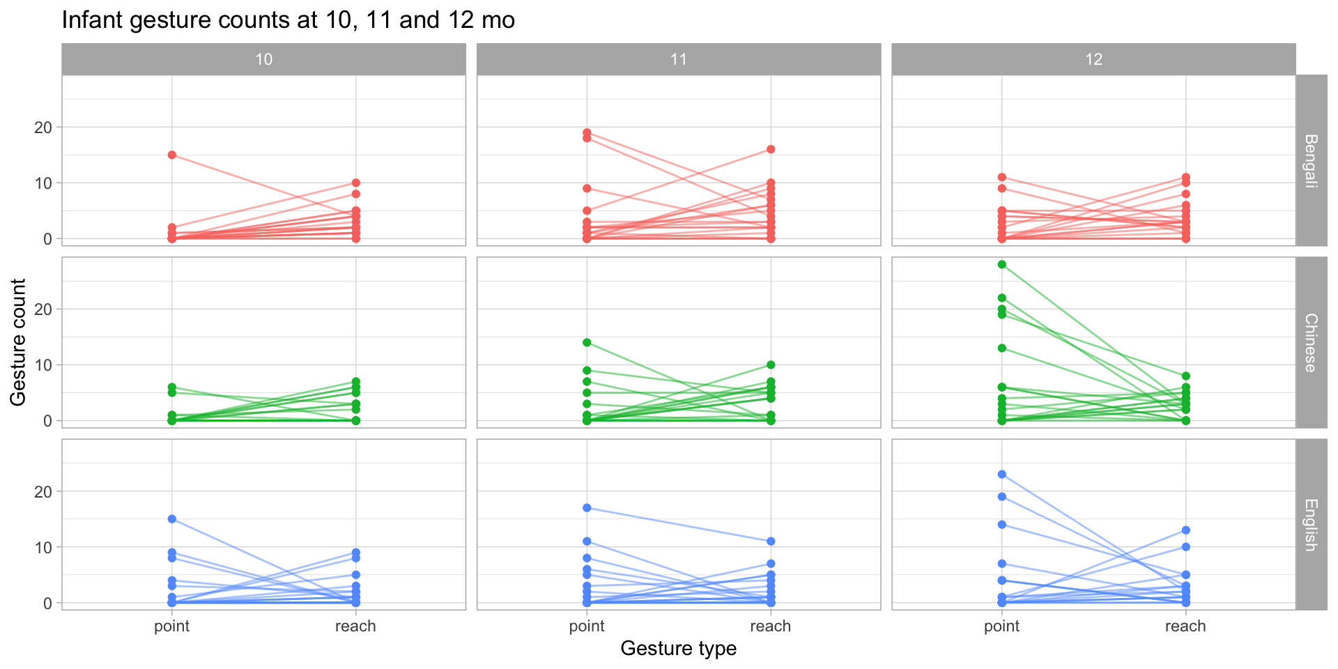
Connected dots plot
gestures |>
  filter(gesture != "ho_gv", count < 30) |>
  group_by(dyad, background, months, gesture) |>
  summarise(
    count_tot = sum(count),
    .groups = "drop"
  ) |>
  ggplot(aes(gesture, count_tot, colour = background),
         alpha = 0.2) +
  geom_line(aes(group = dyad),
            alpha = 0.5) +
  geom_point() +
  facet_grid(background ~ months) +
  labs(
    title = "Infant gesture counts at 10, 11 and 12 mo",
    x = "Gesture type", y = "Gesture count"
  ) +
  theme_light() +
  theme(legend.position = "none")
Connected dots plot
WALS data
library(ritwals)
wals_data <- intersect_features(c("45A", "70A")) |>
  filter(feature_ID %in% c("45A", "70A")) |>
  select(feature_ID, value, language) |>
  filter(str_detect(value, "No", negate = TRUE)) |>
  pivot_wider(names_from = feature_ID, values_from = value) |>
  count(`45A`, `70A`) |>
  mutate(
    `45A` = factor(`45A`, levels = c("Binary politeness distinction", "Multiple politeness distinctions", "Pronouns avoided for politeness")),
    `70A` = factor(`70A`, levels = c("Second singular and second plural", "Second singular", "Second plural", "Second person number-neutral"))
  ) |>
  drop_na()
wals_data
# A tibble: 8 × 3
`45A` `70A` n
<fct> <fct> <int>
1 Binary politeness distinction Second person number-neutral 10
2 Binary politeness distinction Second plural 1
3 Binary politeness distinction Second singular 5
4 Binary politeness distinction Second singular and second plural 15
5 Multiple politeness distinctions Second person number-neutral 1
6 Multiple politeness distinctions Second singular 2
7 Multiple politeness distinctions Second singular and second plural 7
8 Pronouns avoided for politeness Second person number-neutral 2Alluvial plot
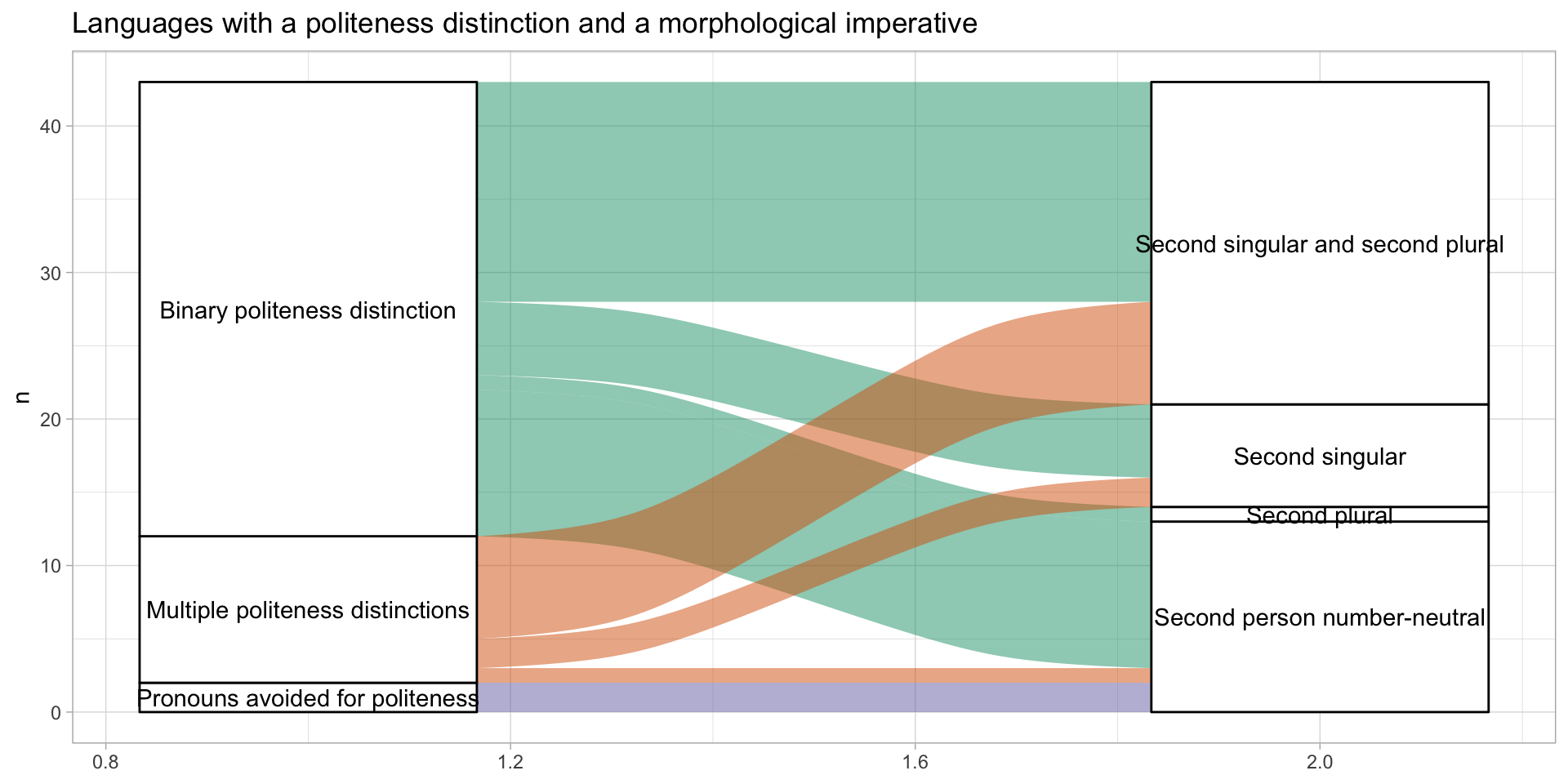
wals_data |>
  ggplot(aes(y = n, axis1 = `45A`, axis2 = `70A`)) +
  geom_alluvium(aes(fill = `45A`)) +
  geom_stratum() +
  geom_text(stat = "stratum",
            aes(label = after_stat(stratum))) +
  scale_fill_brewer(palette = "Dark2") +
  labs(title = "Languages with a politeness distinction and a morphological imperative") +
  theme_light() +
  theme(legend.position = "none")
Alluvial plot
Violin plot
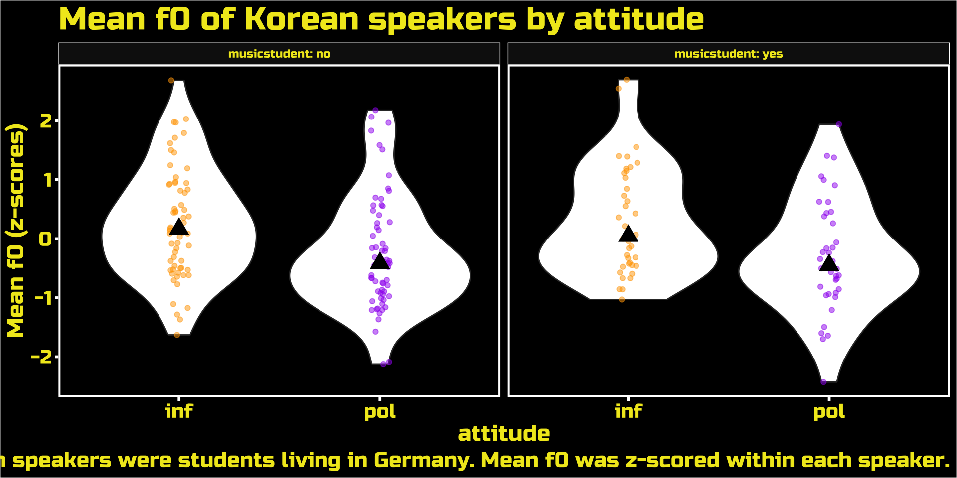
polite |>
  drop_na(f0mn) |>
  group_by(subject) |>
  mutate(f0mn_z = (f0mn - mean(f0mn)) / sd(f0mn)) |>
  ggplot(aes(attitude, f0mn_z)) +
  geom_violin() +
  geom_jitter(aes(colour = attitude),
              width = 0.05,
              alpha = 0.5) +
  stat_summary(fun = "median", geom = "point",
               shape = 17, size = 5) +
  facet_grid(cols = vars(musicstudent), labeller = label_both) +
  scale_color_manual(values = c("orange", "purple")) +
  labs(
    title = "Mean f0 of Korean speakers by attitude",
    y = "Mean f0 (z-scores)",
    caption = "Korean speakers were students living in Germany. Mean f0 was z-scored within each speaker."
  ) +
  ThemePark::theme_starwars() +
  theme(legend.position = "none")
Violin plot
Don’t use box-plots
The Datasaurus example.
Also see post by Nick Desbarats: I’ve stopped using box plots, should you?.

Don’t use error bars
See The issue with error bars by Data To Viz.
Don’t plot means of proportion/percentage means
set.seed(992)
participants <- 10
observations <- round(runif(participants, 1, 15))
probabilities <- runif(participants)
binary_outcomes <- rbinom(participants, size = observations, prob = probabilities)

mean(binary_outcomes / observations)
[1] 0.714881[1] 0.7866667The mean of means is the same as the overall mean only if the N for each participant is the same.
Even in this case, a mean by itself is MEANingless and plotting standard errors with error bars can be misleading (see previous slide).
So plot the proportion of each participant and the overall proportion!
To summarise
Show raw data (e.g. individual observations, participants, items…).
Do not use box-plots, even if you are asked to!
- Use density plots, violin plots, strip charts.
Do not use “error bars”, even if you are asked to!
If the person asking insists, ask “which measure should I use for the error bars?”.
The only sensible answer is “X% Confidence Intervals” (where X is usually 95%).
Do not use means of proportions!
- Calculate the overall proportion and/or show the proportion of each participant as raw data.