x <- 1:10
y <- x^3

plot(x, y)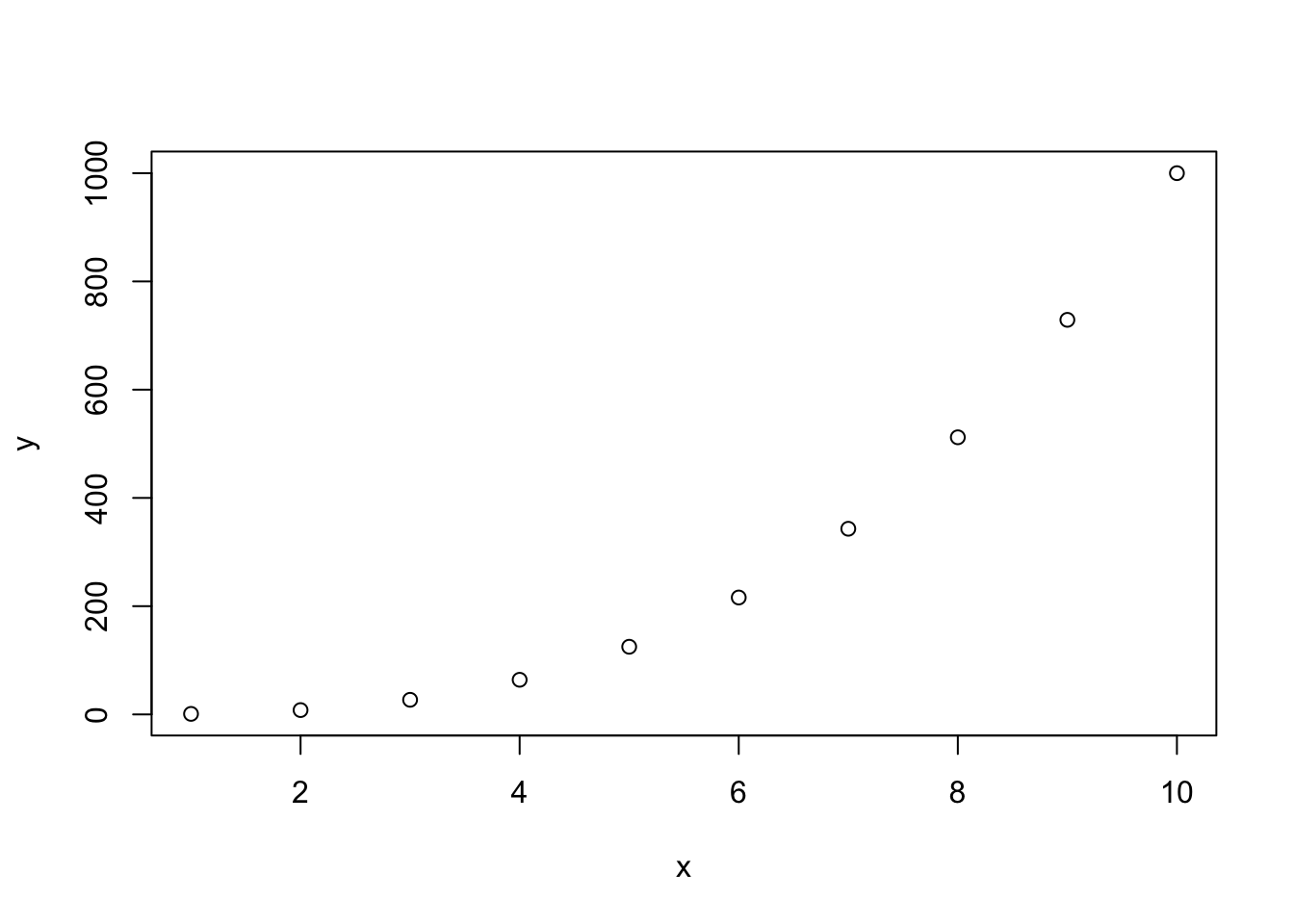
Quarto and Plotting basics
Last week, you learnt how to use R scripts to save your code.
Keeping track of the code you use for data analysis is a very important aspect of research project managing: not only the code is there if you need to rerun it later, but it allows your data analysis to be reproducible (i.e., it can be reproduced by you or other people in such a way that starting with the same data and code you get to the same results).
Research is reproducible when the same data and same code return the same results.
See the Definitions page of The Turing Way for definitions of reproducible, replicable, robust and generalisable research.
R scripts are great for writing code, and you can even document the code (add explanations or notes) with comments (i.e. lines that start with #).
But for longer text or complex data analysis reports, R scripts can be a bit cumbersome.
A solution to this is using Quarto files (they have the .qmd extension).
Research is reproducible when you can produce the same results using the original data and code/methods.
Research is replicable when you can produce the same results using new data and the original code/methods.
Quarto is a file format that allows you to mix code and formatted text in the same file.
This means that you can write dynamic reports using Quarto files: dynamic reports are just like analysis reports (i.e. they include formatted text, plots, tables, code output, code, etc…) but they are dynamic in the sense that if, for example, data or code changes, you can just rerun the report file and all code output (plots, tables, etc…) is updated accordingly!
Quarto is a file type with extension .qmd in which you can write formatted text and code together.
Quarto can be used to generate dynamic reports: these are files that are generated automatically from the file source, ensuring data and results in the report are always up to date.
R comments in R scripts cannot be formatted (for example, you can’t make text bold or italic).
Text in Quarto files can be fully formatted using a simple but powerful mark-up language called markdown.
You don’t have to learn markdown all in one go, so I encourage you to just learn it bit by bit, at your pace. You can look at the the Markdown Guide for an in-depth intro and/or dive in the Markdown Tutorial for a hands-on approach.
A few quick pointers (you can test them in the Markdown Live Preview):
Text can be made italics by enclosing it between single stars: *this text is in italics*.
You can make text bold with two stars: **this text is bold!**.
Headings are created with #:
A mark-up language is a text-formatting system consisting of symbols or keywords that control the structure, formatting or relationships of textual elements. The most common mark-up languages are HTML, XML and TeX.
Markdown is a simple yet powerful mark-up language.
.qmd fileWhen working through these tutorials, always make sure you are in the course Quarto Project you created before.
You know you are in a Quarto Project because you can see the name of the Project in the top-right corner of RStudio, next to the light-blue cube icon.
If you see Project (none) in the top-right corner, that means you are not in the Quarto Project.
To make sure you are in the Quarto project, you can open the project by going to the project folder in File Explorer (Windows) or Finder (macOS) and double click on the .Rproj file.
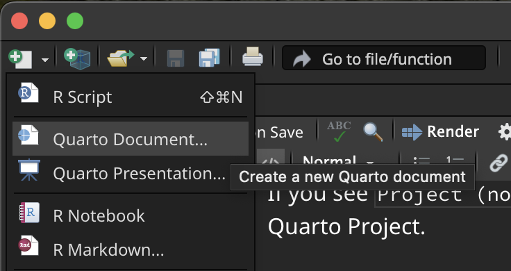
To create a new .qmd file, just click on the New file button (the white square with the green plus symbol), then Quarto Document.... (If you are asked to install/update packages, do so.)
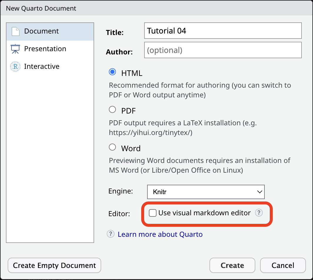
A window will open. Add a title of your choice and your name. Make sure the Use visual markdown editor is NOT ticked, then click Create (you will be free to use the visual editor later, but it is important that you first see what a Quarto document looks like under the hood first).
A new .qmd file will be created and will open in the File Editor panel in RStudio.
Note that creating a Quarto file does not automatically save it on your computer. To do so, either use the keyboard short-cut CMD+S/CTRL+S or click on the floppy disk icon in the menu below the file tab.
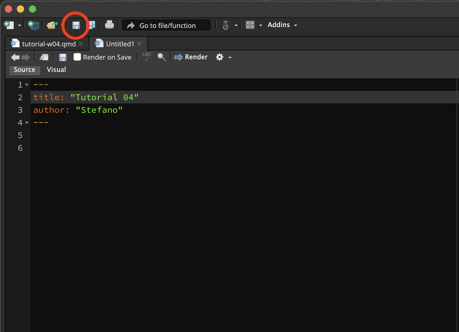
Save the file inside the code/ folder with the following name: tutorial-w04.qmd.
Remember that all the files of your RStudio project don’t live inside RStudio but on your computer.
A Quarto file usually has three main parts:
The YAML header (green in the screenshot below).
Code chunks (red).
Text (blue).
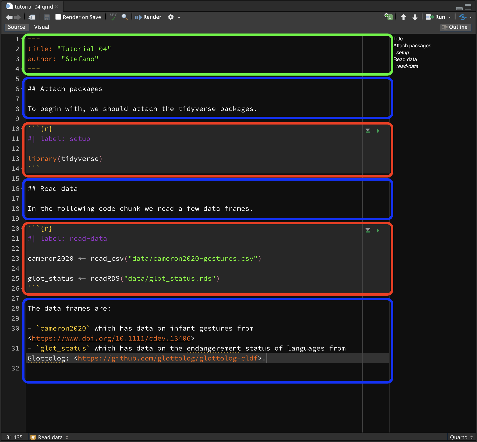
Each Quarto file has to start with a YAML header, but you can include as many code chunks and as much text as you wish, in any order.
The header of a .qmd file contains a list of key: value pairs, used to specify settings or document info like the title and author.
YAML headers start and end with three dashes ---.
Code chunks start and end with three back-ticks ``` and they contain code.
{r} indicates that the code is R code. Settings can be specified inside the chunk with the #| prefix: for example #| label: setup sets the name of the chunk (the label) to setup.
When using Quarto projects, the working directory (the directory all relative paths are relative to) is the project folder.
However, when running code from a Quarto file, the code is run as if the working directory were the folder in which the file is saved.
This isn’t an issue if the Quarto file is directly in the project folder, but in our case our Quarto files live in the code/ folder within the project folder (and it is good practice to do so!).
We can instruct R to always run code from the project folder (i.e. the working directory is the project folder). This is when the _quarto.yml file comes into play.
Open the _quarto.yml file in RStudio (you can simply click on the file in the Files tab and that will open the file in the RStudio editor). Add the line execute-dir: project under the title. Note that indentation should be respected, so the line you write should align with title:, not with project:.
Now, all code in Quarto files, no matter where they are saved, will be run with the project folder as the working directory.
You will use the Quarto document you created to write text and code for this tutorial.
Delete everything in the Quarto document below the YAML header. It’s just example text—we’re not attached to it!
This is what the Quarto document should look like now (if your YAML header also contains “format:html, that’s completely fine):
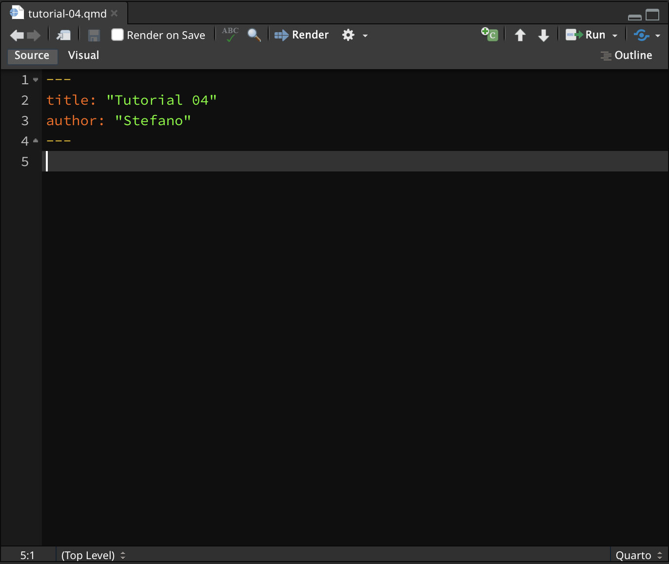
Now add an empty line and in the following line write a second-level heading ## Attach packages, followed by two empty lines. Like so:
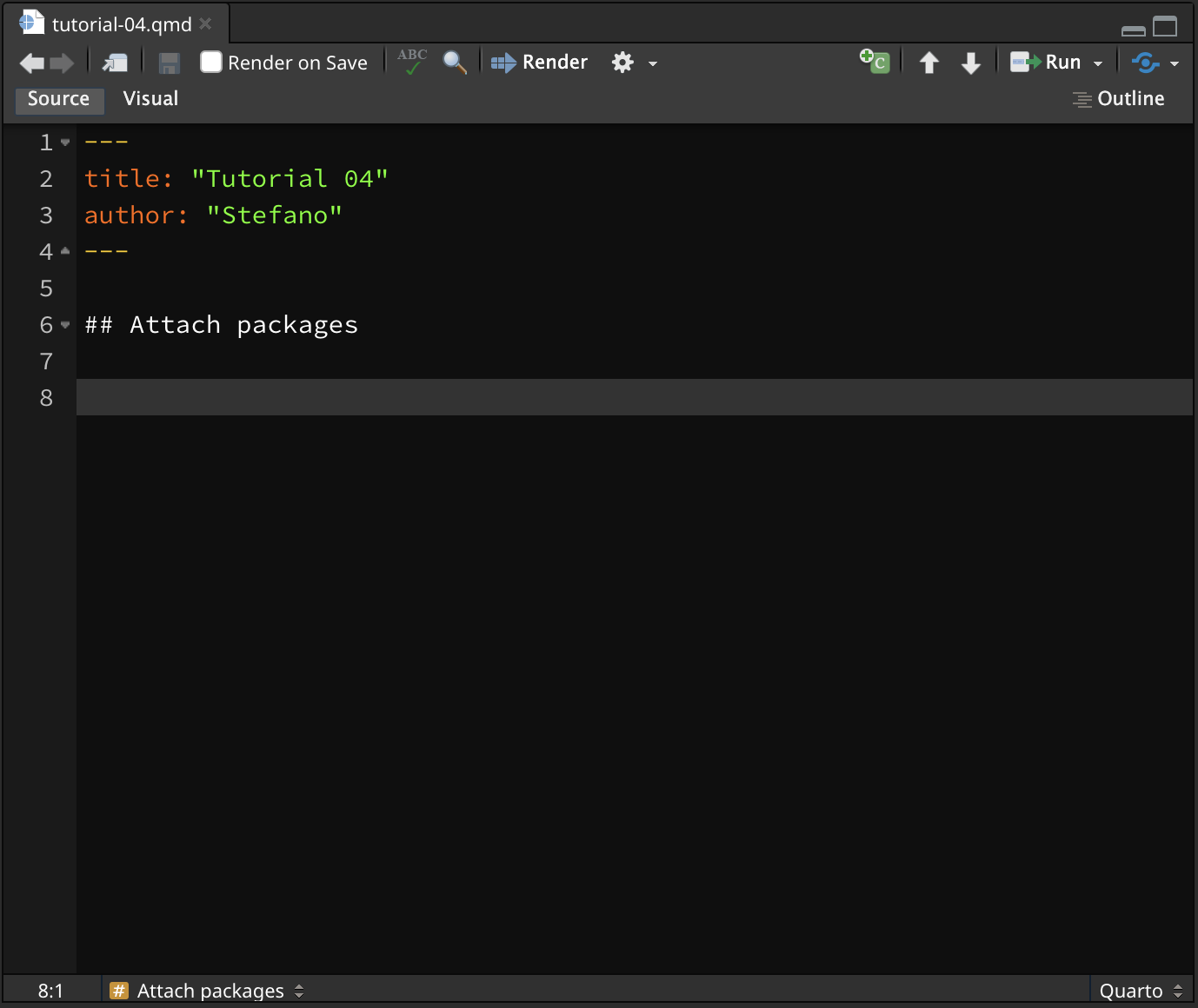
Now we can insert a code chunk to add the code to attach the tidyverse. To insert a new code chunk, you can click on the Insert a new code chunk button (the little green square icon with a C and a plus) , or you can press OPT+CMD+I/ALT+CTRL+I.
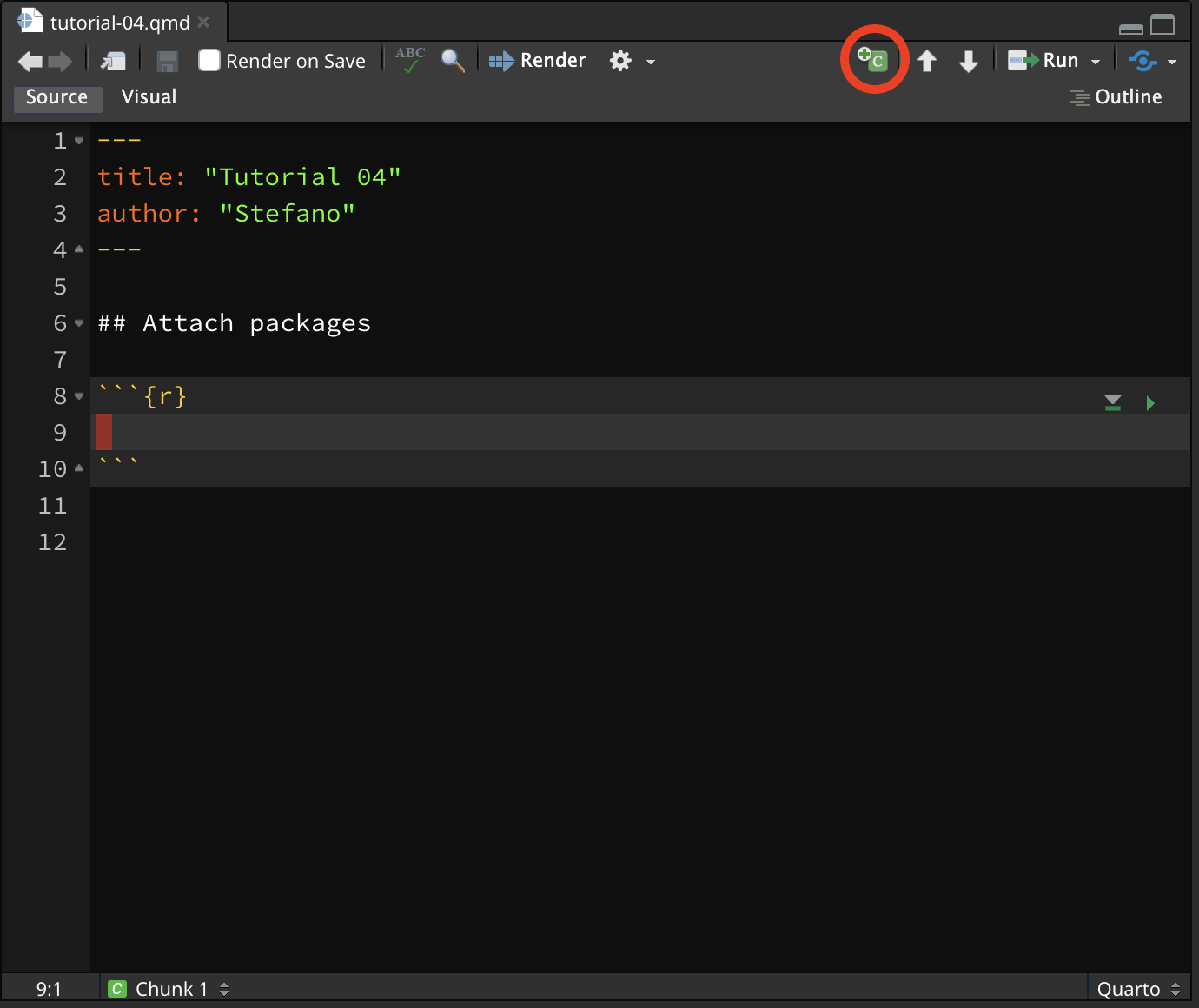
A new R code chunk will be inserted at the text cursor position.
Now go ahead and add the following lines of code inside the R code chunk.
To run the code, you have two options:
You click the small green triangle in the top-right corner of the chunk. This runs all the code in the code chunk.
Ensure the text cursor is inside the code chunk and press SHIFT+CMD+ENTER/SHIFT+CTRL+ENTER. This too runs all the code in the code chunk.
If you want to run line by line in the code chunk, you can place the text cursor on the line you want to run and press CMD+ENTER/CTRL+ENTER. The current line is run and the text cursor is moved to the next line. Just like in the .R scripts that we’ve been using in past weeks.
Run the setup chunk now.
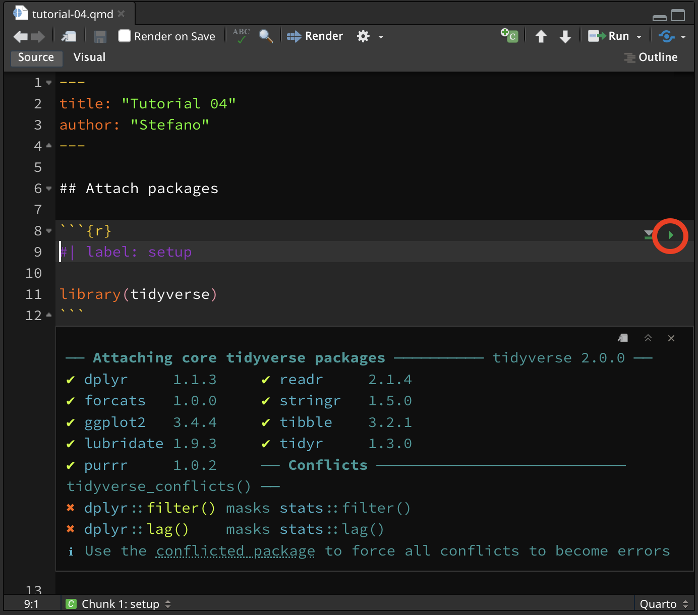
You will see messages printed below the code chunk, in your Quarto file (don’t worry about the Conflicts, they just tell you that some functions from the tidyverse packages have replaced the base R functions, which is OK).
Try this yourself:
Create a new second-level heading (with ##) called Read data.
Create a new R code chunk.
Set the label of the chunk to read-data.
Add code to read the following files (hint: think about where these files are located relative to the working directory, that is, the project folder). Assign the datasets to the variable names polite and glot_status respectively.
winter2012/polite.csv
coretta2022/glot_status.rds
Run the code.
You can render a .qmd file into a nicely formatted HTML file.
To render a Quarto file, just click on the Render button and an HTML file will be created and saved in the same location of the Quarto file.
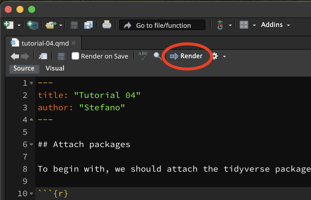
It may be shown in the Viewer pane (like in the picture below) or in a new browser window. There are a few ways you can set this option to whichever version you prefer. Follow the instructions that work for you—they all do the same thing.
Tools > Global Options > R Markdown > Show output preview in…Preferences > R Markdown > Basics > Show output preview in….Render button, you will see a little white gear. Click on that gear, and a drop-down menu will open. Click on Preview in Window or Preview in Viewer Pane, whichever you prefer.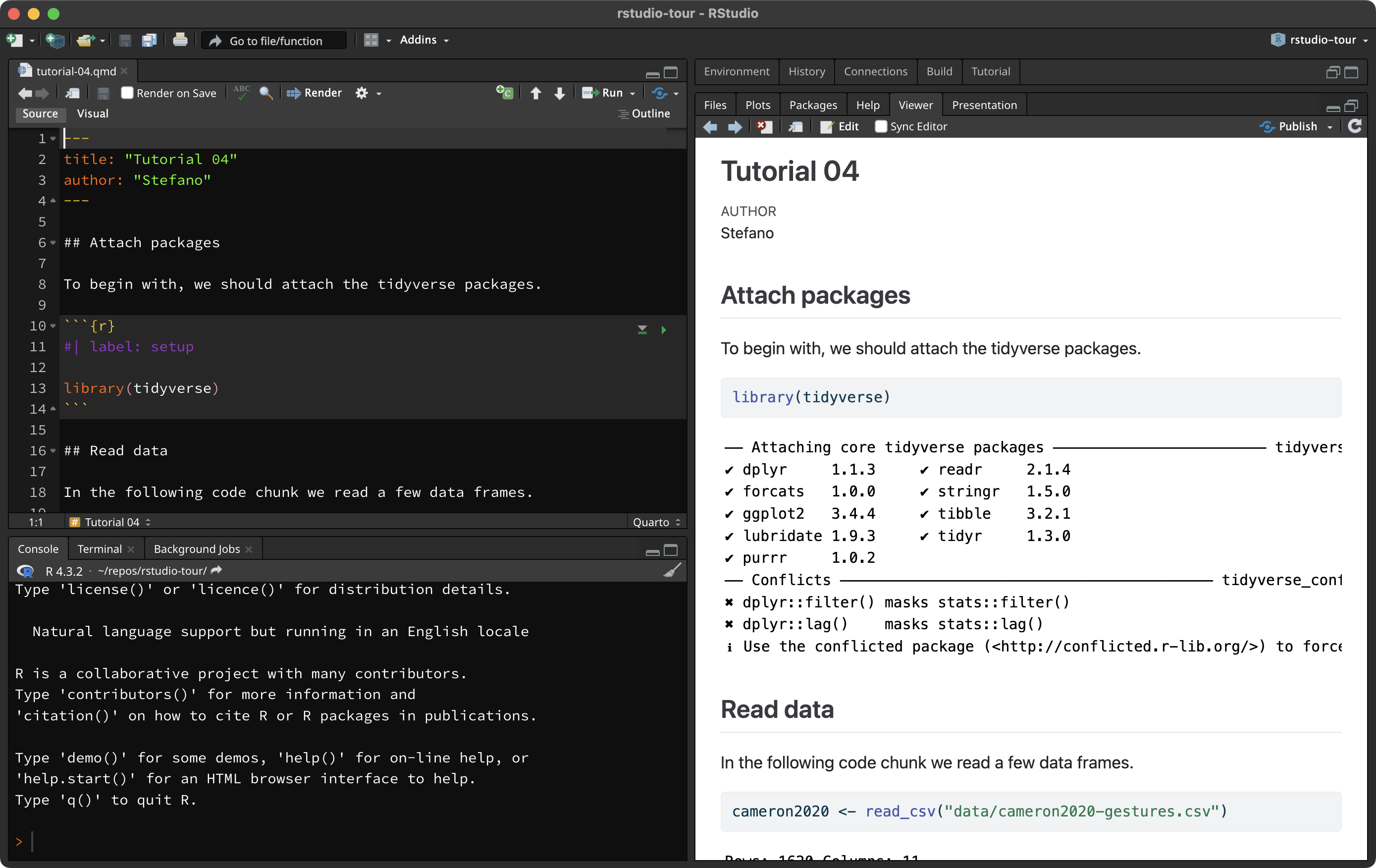
Rendering Quarto files is not restricted to HTML, but also PDFs and even Word documents!
This is very handy when you are writing an analysis report you need to share with others.
Quarto files can be rendered into other formats, like HTML, PDF and Word documents.
The assessments of this course will require you to write text and code in a Quarto file and render it to HTML.
You could even write your dissertation in Quarto!
The following sections will introduce you to the basics of plotting data. You will keep learning how to create plots throughout the course.
Plotting data in R is easy once you understand the basics.
Create a new second-level header in your Quarto document called ## Making plots. Everything else in this tutorial will go into this section.
In R, you can create plots using different systems.
In this course you will learn how to use the ggplot2 system, but before we dive in, let’s have a look at the base R plotting system too.
Let’s create two vectors, x and y and plot them. For now, run the following code in the Console (not in the Quarto document).
Easy!
Now let’s add a few more things.
With plots as simple as this one, the base R plotting system is sufficient, but to create more complex plots (which is virtually always the case), base R gets incredibly complicated.
Instead we can use the tidyverse package ggplot2. ggplot2 works well with the other tidyverse packages and it follows the same principles, so it is convenient to use it for data visualisation instead of base R!
The tidyverse package ggplot2 provides users with a consistent set of functions to create captivating graphics.
To be able to use the functions in a package, you first need to attach the package. We have already attached the library(tidyverse) packages, among which there is ggplot2, so you don’t need to do anything else.
We will first use the polite data to learn the basics of plotting using ggplot (remember you read this data in before in Practice 1?).
In this tutorial we will use the following columns:
f0mn: mean f0 (fundamental frequency).
H1H2: difference between H2 and H1 (second and first harmonic). A higher H1-H2 difference indicates greater breathiness.
These are the minimum constituents of a ggplot2 plot.
The data: you have to specify the data frame with the data you want to plot.
The mapping: the mapping tells ggplot how to map data columns to parts of the plot like the axes or groupings within the data. (For example, which variable is shown on the x axis, and which one is on the y axis? If data comes from two different groups, should each group get its own colour?) These different parts of the plot are called aesthetics, or aes for short.
You can specify the data and mapping with the data and mapping arguments of the ggplot() function.
Note that the mapping argument is always specified with aes(): mapping = aes(…).
In the following bare plot, we are just mapping f0mn to the x-axis and H1H2 to the y-axis, from the polite data frame.
Create a new code chunk, copy the following code and run it. From this point on I will assume you’ll create a new code chunk and run the code yourself, without explicit instructions.
Not much to see here: just two axes! So where’s the data? Don’t worry, we didn’t do anything wrong. Showing the data itself requires a further step, which we’ll turn to next.
Our code so far makes nice axes, but we are missing the most important part: showing the data!
Data is represented with geometries, or geoms for short. geoms are added to the base ggplot with functions whose names all start with geom_.
Geometries are plot elements that show the data through geometric shapes.
Different geometries are added to a ggplot using one of the geom_*() functions.
For this plot, you want to use geom_point(). This geom simply adds point to the plot based on the data in the polite data frame.
To add geoms to a plot, you write a + at the end of the ggplot() command and include the geom on the next line. For example:
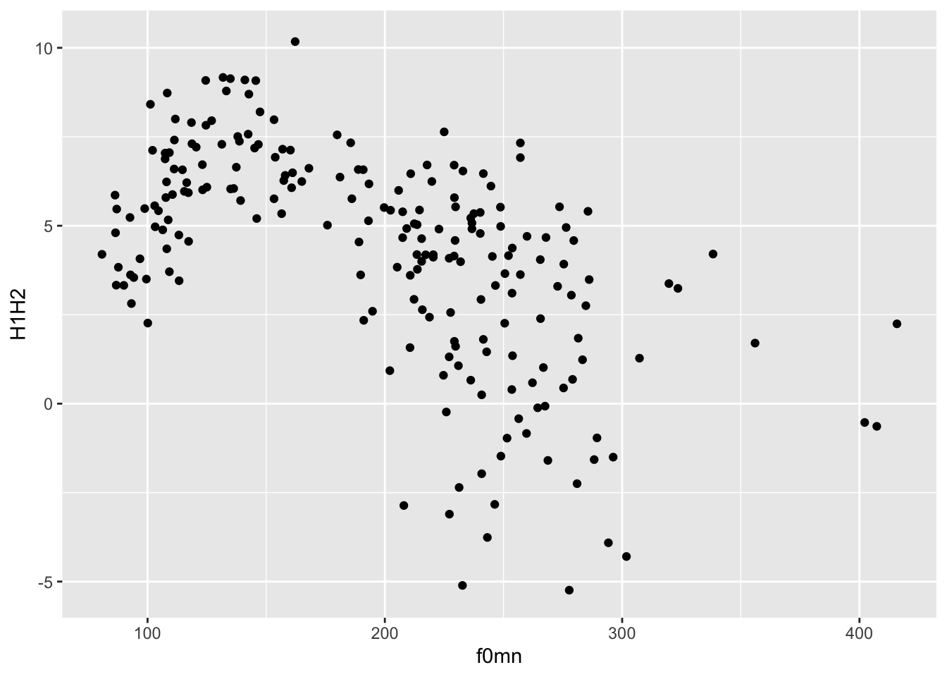
This type of plot, with two continuous axes and data represented by points, is called a scatter plot.
A scatter plot is a plot with two numeric axes and points indicating the data. It is used when you want to show the relationship between two numeric variables.
To create a scatter plot, use the geom_point() geometry.
When writing your results section, you could describe the plot this way:
Figure 1 shows a scatter plot of mean f0 on the x-axis and H1-H2 difference on the y-axis. The plot suggest an overall negative relationship between mean f0 and H1-H2 difference. In other words, increasing mean f0 corresponds to decreasing breathiness.
Note that using the + is a quirk of ggplot(). The idea behind it is that you start from a bare plot and you add (+) layers of data on top of it. This is because of the philosophy behind the package, called the Layered Grammar of Graphics. In fact, Grammar of Graphics is where you get the GG in ggplot!
Note that the data and mapping arguments don’t have to be named explicitly (with data = and mapping =) in the ggplot() function, since they are obligatory and they are specified in that order.
In fact, you can also leave out x = and y =.
Try running ?ggplot in the Console to see the arguments of the function and the order they appear in.
When specifying arguments, the order matters when not using the argument names.
So aes(a, b) is different from aes(b, a).
But aes(y = b, x = a) is the same as aes(a, b).
The code of the latest plot can also be written this way.
Wait, what is that thing, |>?
It’s called a pipe. Think of a pipe as a teleporter.
The pipe |> teleports the data polite into the following function as the first argument. So polite |> ggplot() is equivalent to ggplot(polite).
For now it might not make much sense using the pipe, but you will learn next week how to chain many functions one after the other using the pipe, at which point its usefulness will be more obvious.
As a sneak peek, you will be able to filter the data before plotting it, like so:
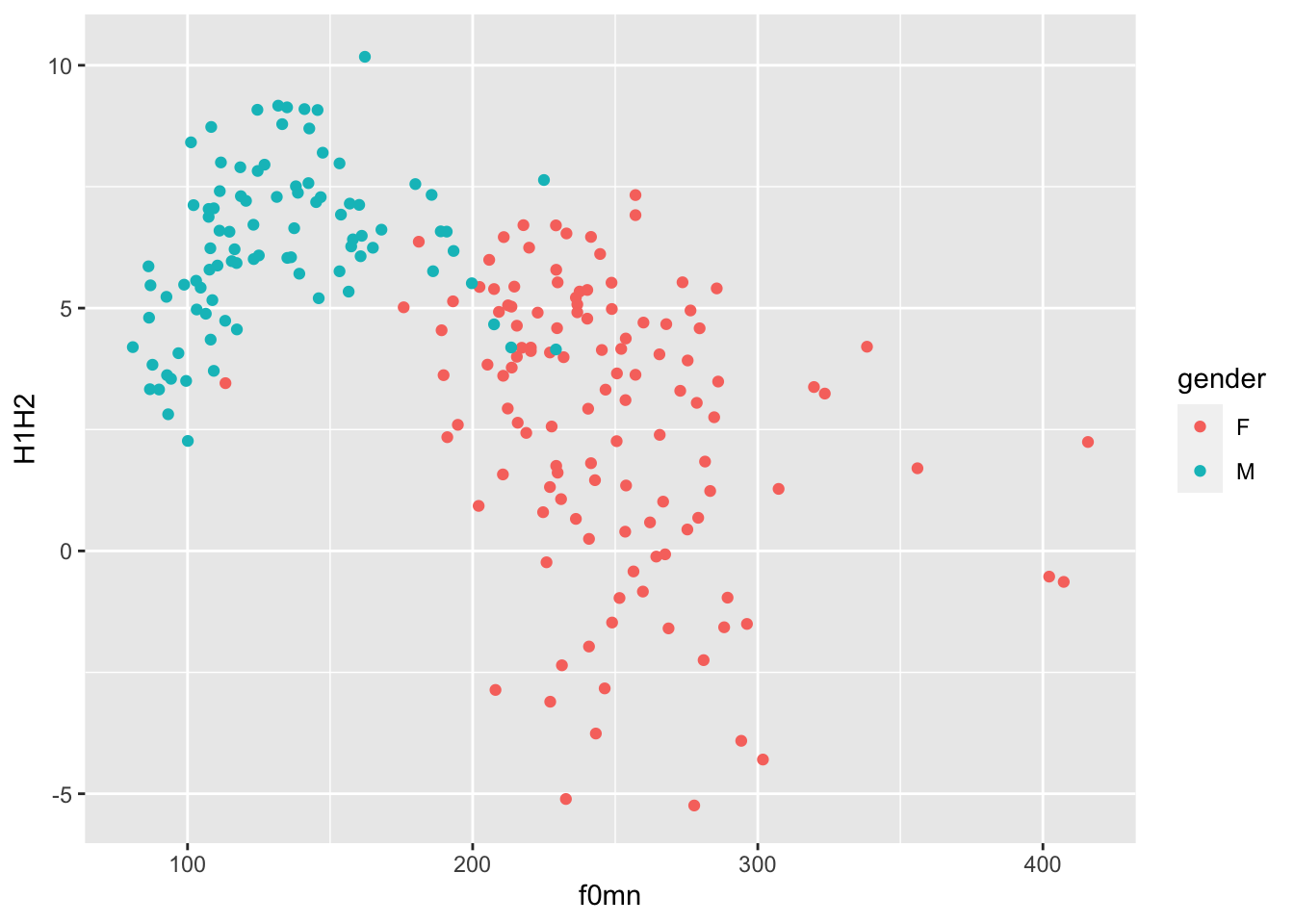
colour aestheticYou might notice that there seems to be two subgroups within the data: one below about 200 Hz and one above about it.
In fact, these subgroups are related to gender. Let’s colour the points by gender then.
You can use the colour aesthetic to colour the points by gender, like so:
colour or color?
To make ggplot easy for users of different Englishes, it’s possible to write the colour aesthetic either as the British-style colour or the American-style color! Both will get the job done.
Notice how colour = gender must be inside the aes() function, because we are trying to map colour to the values of the column gender. Colours are automatically assigned to each level in gender.
The default colour palette is used, but you can customise it. You will learn later in the course how to create custom palettes, but you can quickly change palette using one of the scale_colour_*() functions.
A useful function is the scale_colour_brewer() function. This function creates palettes based on ColorBrewer 2.0. There are three types of palettes (see the linked website for examples):
Sequential (seq): a gradient sequence of hues from lighter to darker.
Diverging (div): useful when you need a neutral middle colour and sequential colours on either side of the neutral colour.
Qualitative (qual): useful for categorical variables.
Let’s use the default qualitative palette.
polite |>
  ggplot(aes(f0mn, H1H2, colour = gender)) +
geom_point() +
scale_color_brewer(type = "qual")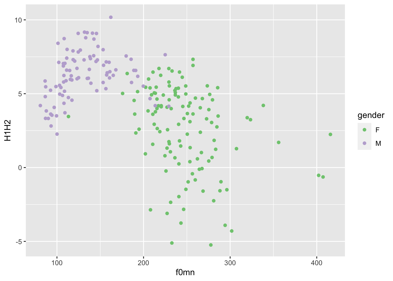
Now try changing the palette argument of the scale_colour_brewer() function to different palettes. (Check the function documentation for a list).
Another set of palettes is provided by scale_colour_viridis_d() (the d stands for “discrete” palette, to be used for categorical variables). Here’s an example.
polite |>
  ggplot(aes(f0mn, H1H2, colour = gender)) +
  geom_point() +
  scale_color_viridis_d(option = "B")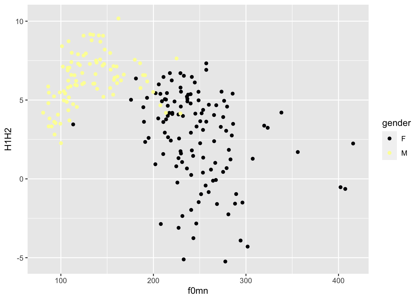
If you want to know more about the default colour palette, check this blog post out.
alpha aestheticAnother useful ggplot2 aesthetic is alpha. This aesthetic sets the transparency of the geometry: 0 means completely transparent and 1 means completely opaque.
Change alpha in the code below to 0.5.
When you are setting a value yourself that should apply to all instances of some geometry, rather than mapping an aesthetic to values in a specific column (like we did above with colour), you should add the aesthetic outside of aes() and usually in the geom function you want to modify.
Setting a lower alpha is useful when there are a lot of points or other geometries that overlap with each other and it just looks like a blob of colour (you can’t really see the individual geometries; you will see an example next week). It is not the case here, and in fact reducing the alpha makes the plot quite illegible!
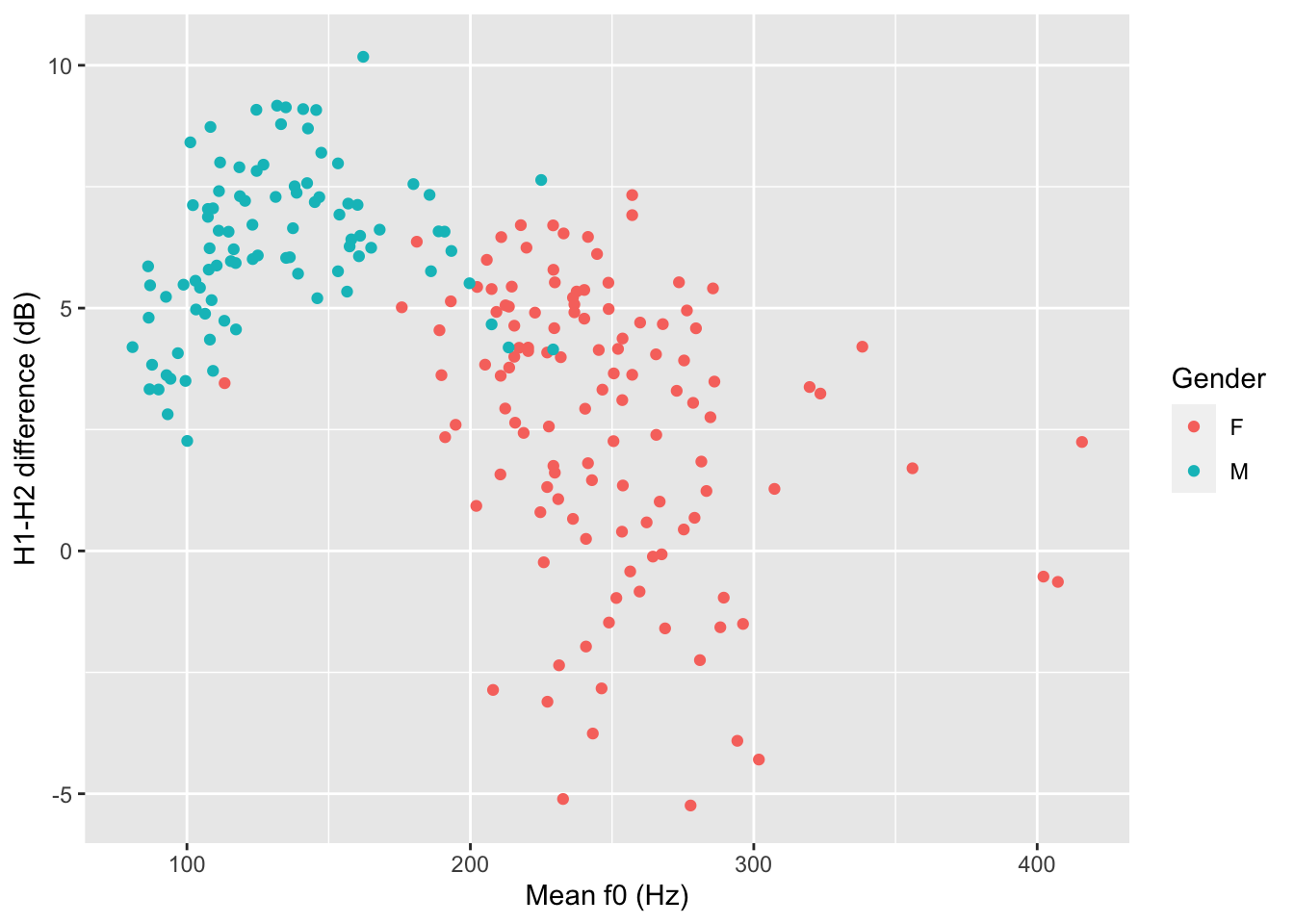
If you want to change the labels of the axes and the legend, you can use the labs() function, like this.
polite |>
  ggplot(aes(f0mn, H1H2, colour = gender)) +
  geom_point() +
  labs(
    x = "Mean f0 (Hz)",
    y = "H1-H2 difference (dB)",
    colour = "Gender"
  )
Also add a title and a subtitle (use these two arguments within the labs() function).
For example, labs(title = "...", ...).
Now that you have done all of this hard work, why don’t you try and render the Quarto file you’ve been working on to an HTML file?
Go ahead, click on the “Render” button and if everything works fine you should see a rendered HTML file in a second!
Note that you will be asked to render your Quarto files for the assessments, so I recommend you try this out now.
That’s all for this week!
Quarto
Quarto files can be used to create dynamic and reproducible reports.
Mark-up languages are text-formatting systems that specify text formatting and structure using symbols or keywords. Markdown is the mark-up language that is used in Quarto documents.
The main parts of a .qmd file are the YAML header, text and code chunks.
Plotting
ggplot2 is a plotting package from the tidyverse.
To create a basic plot, you use the ggplot() function and specify data and mapping.
The aes() function allows you to specify aesthetics (like axes, colours, …) in the mapping argument.
Geometries map data values onto shapes in the plot. All geometry functions are of the type geom_*().
Scatter plots are created with geom_point() and can be used with two numeric variables.