glot_statusDAL tutorial - Week 5
Data transformation
1 Data transformation
Data transformation is a fundamental aspect of data analysis.
After the data you need to use is imported into R, you will have to filter rows, create new columns, or join data frames, among many other transformation operations.
In this tutorial we will learn how to filter() the data and mutate() or create new columns. In Week 6 (after Flexible Learning week) you will learn how to obtain summary measures and how to count occurrences using the summarise(), group_by() and count() functions.
2 Filter
Filtering data based on specific criteria couldn’t be easier with filter(), from the dplyr package (one of the tidyverse core packages),
Let’s work with the coretta2022/glot_status data frame. It’s an .rds file, so you need to use the readRDS() function. Go ahead and read the data into glot_status.
The glot_status data frame contains the endangerment status for 7,845 languages from Glottolog. There are thousands of languages in the world, but most of them are losing speakers, and some are already no longer spoken. The endangerment status of a language in the data is on a scale from not endangered (languages with large populations of speakers) through threatened, shifting and nearly extinct, to extinct (languages that have no living speakers left).
Before we can move on onto filtering data, we first need to learn about logical operators.
2.1 Logical operators
There are four main logical operators:
x == y:xequalsy.x != y:xis not equal toy.x > y:xis greater thany.x < y:xis smaller thany.
Logical operators return TRUE or FALSE depending on whether the statement they convey is true or false. Remember, TRUE and FALSE are logical values.
Try these out in the Console:
# This will return FALSE
1 == 2[1] FALSE# FALSE
"apples" == "oranges"[1] FALSE# TRUE
10 > 5[1] TRUE# FALSE
10 > 15[1] FALSE# TRUE
3 < 4[1] TRUENow let’s see how these work with filter()!
2.2 The filter() function
Filtering in R with the tidyverse is straightforward. You can use the filter() function.
filter() takes one or more statements with logical operators.
Let’s try this out. The following code filters the status column so that only the extinct status is included in the new data frame extinct.
You’ll notice we are using the pipe |> to transfer the data into the filter() function; the output of the filter function is assigned <- to extinct. The flow might seem a bit counter-intuitive but you will get used to think like this when writing R code soon enough!
extinct <- glot_status |>
filter(status == "extinct")
extinctNeat! What if we want to include all statuses except extinct? Easy, we use the non-equal operator !=.
not_extinct <- glot_status |>
filter(status != "extinct")
not_extinctAnd if we want only non-extinct languages from South America? We can include multiple statements separated by a comma!
south_america <- glot_status |>
filter(status != "extinct", Macroarea == "South America")
south_americaCombining statements like this will give you only those rows where both conditions apply. You can add as many statements as you need.
Now try to filter the data so that you include only not_endangered languages from all macro-areas except Eurasia. This time, don’t save the output to a new data frame. What happens? Where is the output shown?
glot_status |>
filter(...)This is all great, but what if we want to include more than one status or macro-area?
To do that we need another operator: %in%.
2.3 The %in% operator
Try these in the Console:
# TRUE
5 %in% c(1, 2, 5, 7)[1] TRUE# FALSE
"apples" %in% c("oranges", "bananas")[1] FALSEBut %in% is even more powerful because the value on the left does not have to be a single value, but it can also be a vector! We say %in% is vectorised because it can work with vectors (most functions and operators in R are vectorised).
# TRUE, TRUE
c(1, 5) %in% c(4, 1, 7, 5, 8)[1] TRUE TRUEstocked <- c("durian", "bananas", "grapes")
needed <- c("durian", "apples")
# TRUE, FALSE
needed %in% stocked[1] TRUE FALSETry to understand what is going on in the code above before moving on.
2.4 Now filter the data
Now we can filter glot_status to include only the macro-areas of the Global South and only languages that are either “threatened”, “shifting”, “moribund” or “nearly_extinct”. I have started the code for you, you just need to write the line for filtering status.
global_south <- glot_status |>
filter(
Macroarea %in% c("Africa", "Australia", "Papunesia", "South America"),
...
)This should not look too alien! The first statement, Macroarea %in% c("Africa", "Australia", "Papunesia", "South America") looks at the Macroarea column and, for each row, it returns TRUE if the current row value is in c("Africa", "Australia", "Papunesia", "South America"), and FALSE if not.
3 Bar charts
We will first create a plot with counts of the number of languages in global_south by their endangerment status and then a plot where we also split the counts by macro-area.
3.1 Number of languages of the Global South by status
To create a bar chart, you can use the geom_bar() geometry.
Go ahead and complete the following code to create a bar chart.
global_south |>
ggplot(aes(x = status)) +
...Note how we’re using |> to pipe the glot_status data frame into the ggplot() function. This works because ggplot()’s first argument is the data, and piping is a different way of providing the first argument to a function.
As mentioned above, the counting for the y-axis is done automatically. R looks in the status column and counts how many times each value in the column occurs in the data frame.
If you did things correctly, you should get the following plot.
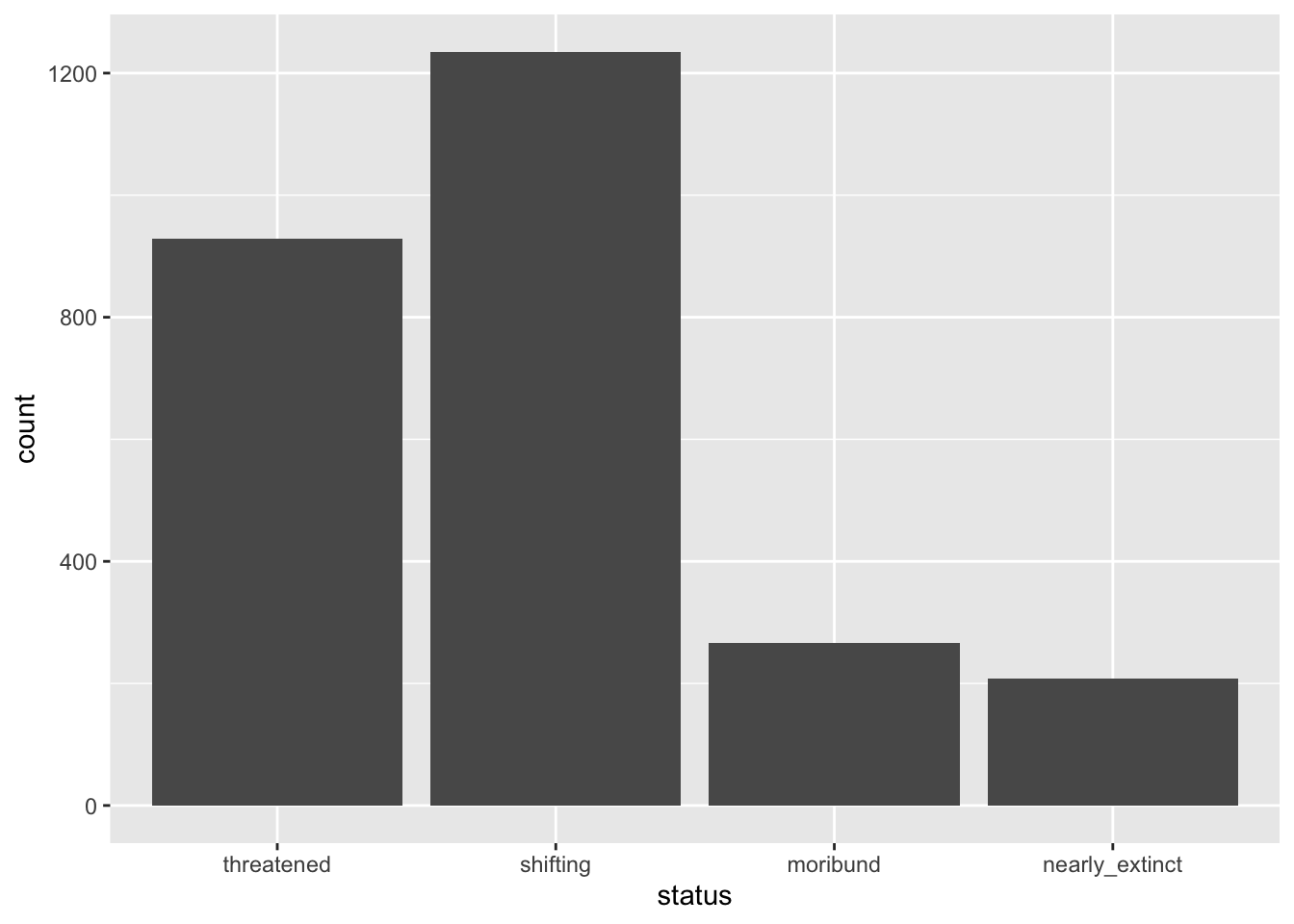
The x-axis is now status and the y-axis corresponds to the number of languages by status (count). As mentioned above, count is calculated under the hood for you (you will learn how to count levels with count() later in the course).
You could write a description of the plot that goes like this:
The number of languages in the Global South by endangered status is shown as a bar chart in Figure 1. Among the languages that are endangered, the majority are threatened or shifting.
What if we want to show the number of languages by endangerment status within each of the macro-areas that make up the Global South? Easy! You can make a stacked bar chart, but we will get to that after we first learn about mutate().
4 Mutate
To change existing columns or create new columns, we can use the mutate() function from the dplyr package.
To learn how to use mutate(), we will re-create the status column (let’s call it Status this time) from the Code_ID column in glot_status.
The Code_ID column contains the status of each language in the form aes-STATUS where STATUS is one of not_endangered, threatened, shifting, moribund, nearly_extinct and extinct.
[1] "aes-shifting" "aes-extinct" "aes-moribund"
[4] "aes-nearly_extinct" "aes-threatened" "aes-not_endangered"We want to create a new column called Status which has only the STATUS label (without the aes- part). To remove aes- from the Code_ID column we can use the str_remove() function from the stringr package. Check the documentation of ?str_remove to learn which arguments it uses.
glot_status <- glot_status |>
mutate(
Status = str_remove(Code_ID, "aes-")
)If you check glot_status now you will find that a new column, Status, has been added. This column is a character column (chr).
Let’s reproduce the bar chart from above but with all the data from glot_status, using now the Status column.
glot_status |>
ggplot(aes(x = Status)) +
geom_bar()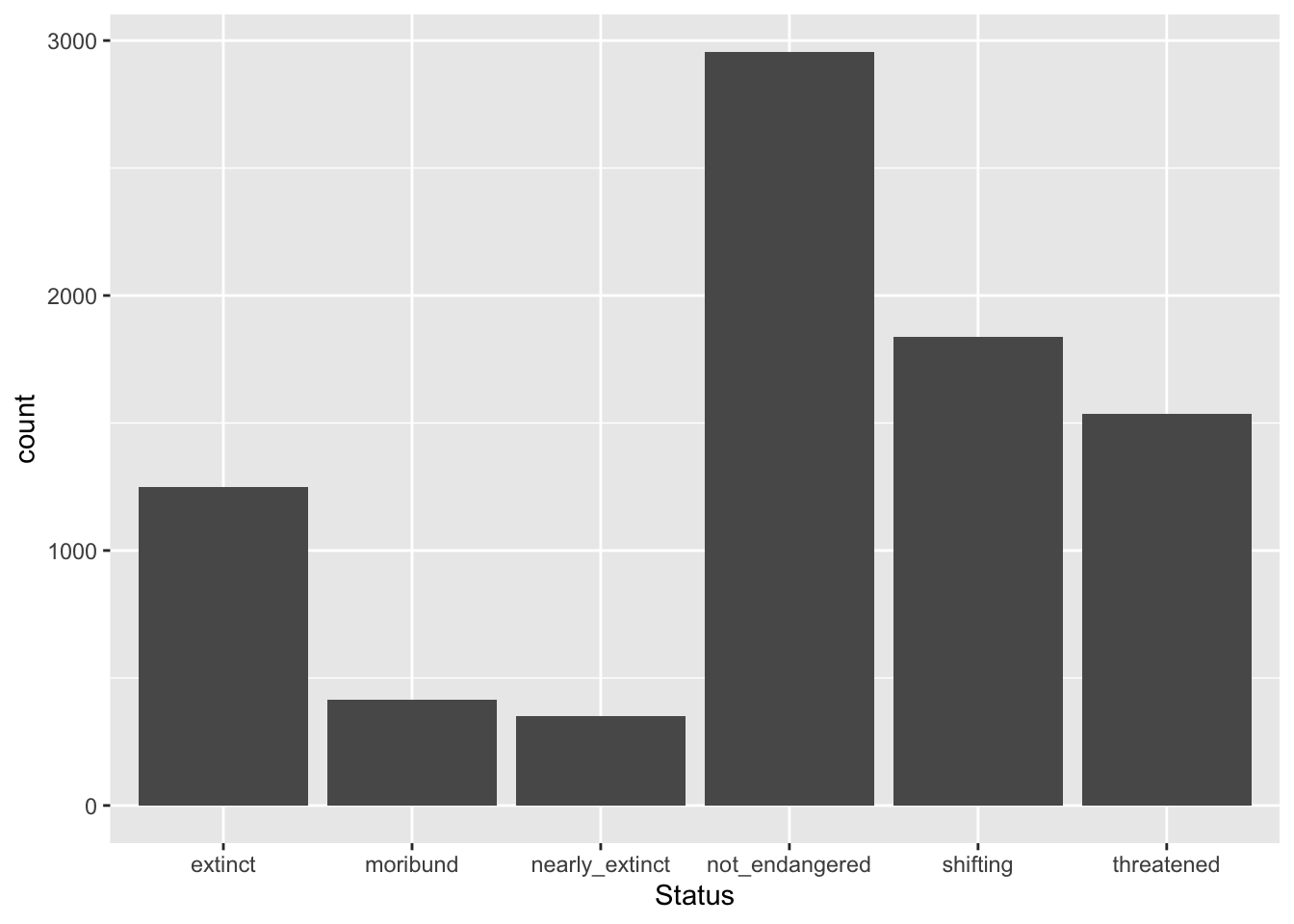
But something is not quite right… The order of the levels of Status does not match the order that makes sense (from least to most endangered)! Why?
This is because status (the pre-existing column) is a factor column, rather than a simple character column. What is a factor vector/column?
A vector/column can be mutated into a factor column with the as.factor() function. In the following code, we change the existing column Status, in other words we overwrite it (this happens automatically, because the Status column already exists, so it is replaced).
glot_status <- glot_status |>
mutate(
Status = as.factor(Status)
)
# read below for an explanation of the dollar disgn $ syntax
levels(glot_status$Status)[1] "extinct" "moribund" "nearly_extinct" "not_endangered"
[5] "shifting" "threatened" The levels() functions returns the levels of a factor column in the order they are stored in the factor: by default the order is alphabetical. But wait, what is that $ in glot_status$Status?
The dollar sign $ a base R way of extracting a single column (in this case Status) from a data frame (glot_status).
What if we want the levels of Status to be ordered in a more logical manner: not_endangered, threatened, shifting, moribund, nearly_extinct and extinct? Easy! We can use the factor() function instead of as.factor() and specify the levels and their order.
glot_status <- glot_status |>
mutate(
Status = factor(Status, levels = c("not_endangered", "threatened", "shifting", "moribund", "nearly_extinct", "extinct"))
)
levels(glot_status$Status)[1] "not_endangered" "threatened" "shifting" "moribund"
[5] "nearly_extinct" "extinct" You see that now the order of the levels returned by levels() is the one we specified.
Transforming character columns to vector columns is helpful to specify a particular order of the levels which can then be used when plotting.
glot_status |>
ggplot(aes(x = Status)) +
geom_bar()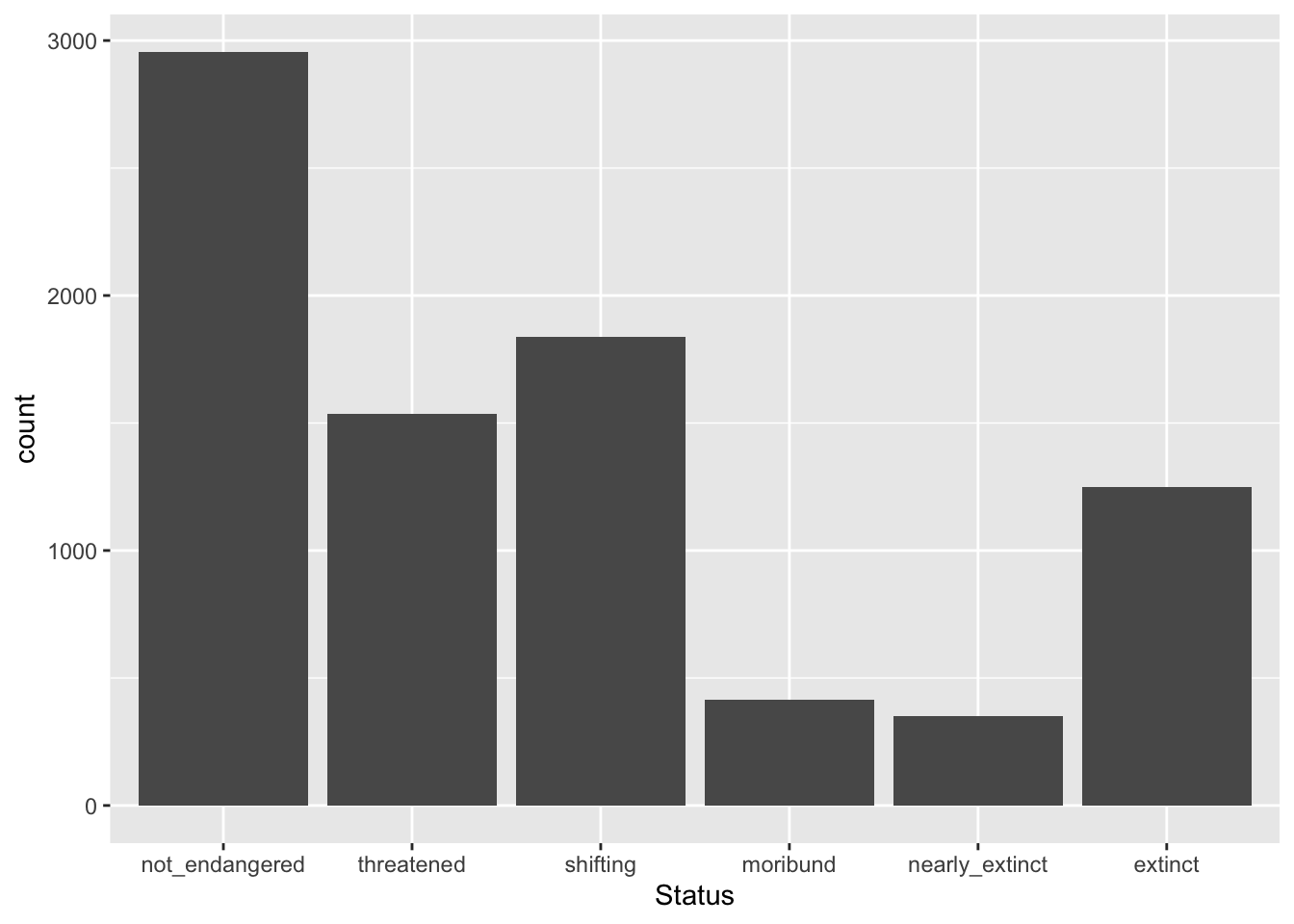
5 Stacked bar charts
A special type of bar charts are the so-called stacked bar charts.
To create a stacked bar chart, you just need to add a new aesthetic mapping to aes(): fill. The fill aesthetic lets you fill bars or areas with different colours depending on the values of a specified column.
Let’s make a plot on language endangerment by macro-area.
Complete the following code by specifying that fill should be based on status.
global_south |>
ggplot(aes(x = Macroarea, ...)) +
geom_bar()You should get the following.
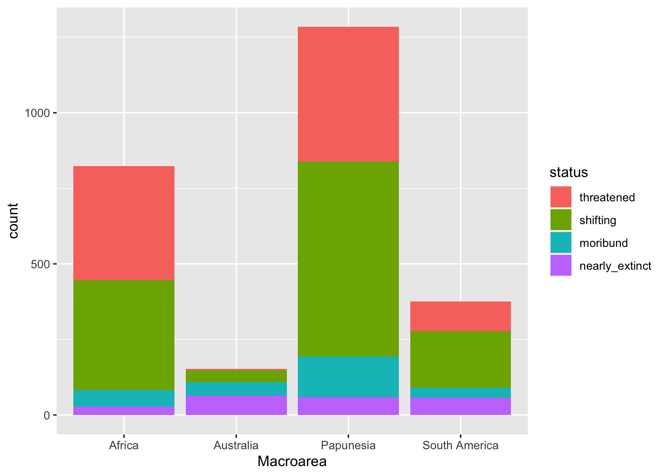
A write-up example:
Figure 4 shows the number of languages by geographic macro-area, subdivided by endangerment status. Africa, Eurasia and Papunesia have substantially more languages than the other areas.
6 Filled stacked bar charts
In the plot above it is difficult to assess whether different macro-areas have different proportions of endangerment. This is because the overall number of languages per area differs between areas.
A solution to this is to plot proportions instead of raw counts.
You could calculate the proportions yourself, but there is a quicker way: using the position argument in geom_bar().
You can plot proportions instead of counts by setting position = "fill" inside geom_bar(), like so:
global_south |>
ggplot(aes(x = Macroarea, fill = status)) +
geom_bar(position = "fill")
The plot now shows proportions of languages by endangerment status for each area separately.
Note that the y-axis label is still “count” but should be “proportion”. Use labs() to change the axes labels and the legend name.
global_south |>
ggplot(aes(x = Macroarea, fill = status)) +
geom_bar(position = "fill") +
labs(
...
)You should get this.
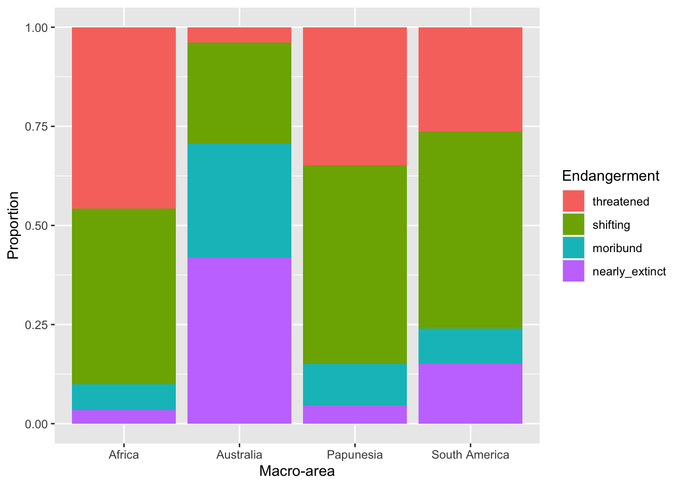
With this plot it is easier to see that different areas have different proportions of endangerment. In writing:
Figure 6 shows proportions of languages by endangerment status for each macro-area. Australia, South and North America have a substantially higher proportion of extinct languages than the other areas. These areas also have a higher proportion of near extinct languages. On the other hand, Africa has the greatest proportion of non-endangered languages followed by Papunesia and Eurasia, while North and South America are among the areas with the lower proportion, together with Australia which has the lowest.
7 Faceting and panels
Sometimes we might want to separate the data into separate panels within the same plot.
We can achieve that easily using faceting.
7.1 Polite again
Let’s reproduce this plot from Week 4, but this time let’s spice things up.
This is the plot you made in Week 4. Try and reproduce it by writing the code yourself (you also have to read in the data!).
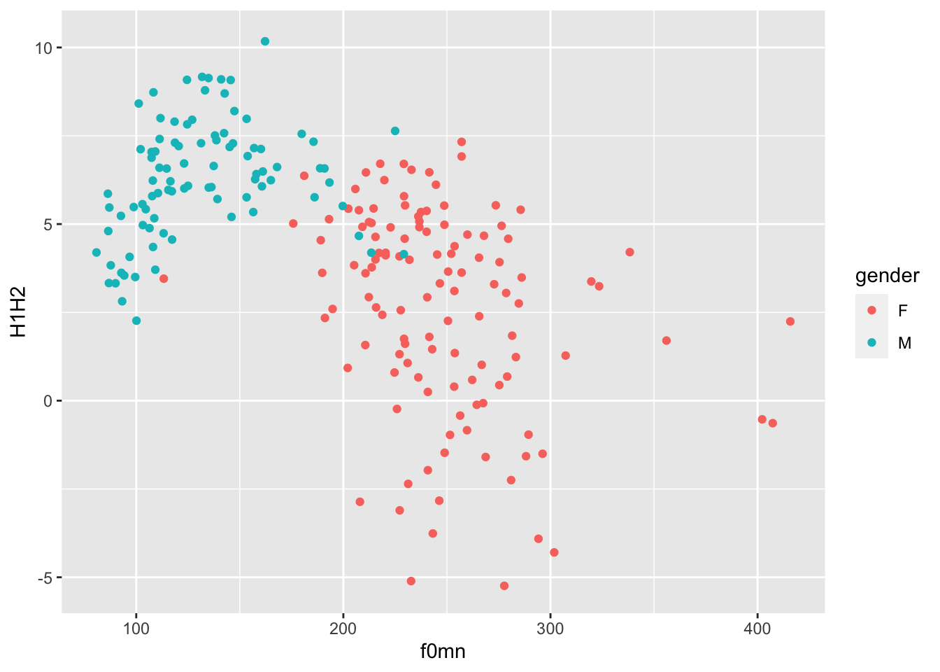
7.2 Does being a music student matter?
That looks great, but we want to know if being a music student has an effect on the relationship of f0mn and H1H2.
In the plot above, the aesthetics mappings are the following:
f0mnon the x-axis.H1H2on the y-axis.genderas colour.
How can we separate data further depending on whether the participant is a music student or not (musicstudent)?
We can create panels using facet_grid(). This function takes lists of variables to specify panels in rows and/or columns.
7.2.1 Faceting
Faceting a plot allows to split the plot into multiple panels, arranged in rows and columns, based on one or more variables.
To facet a plot, use the facet_grid() function.
The syntax is a bit strange. You can specify rows of panels with the rows argument and columns of panels with cols argument, but you have to include column names inside vars(), like this:
polite |>
ggplot(aes(f0mn, H1H2, colour = gender)) +
geom_point() +
facet_grid(cols = vars(musicstudent)) +
labs(
x = "Mean f0 (Hz)",
y = "H1-H2 difference (dB)",
colour = "Gender"
)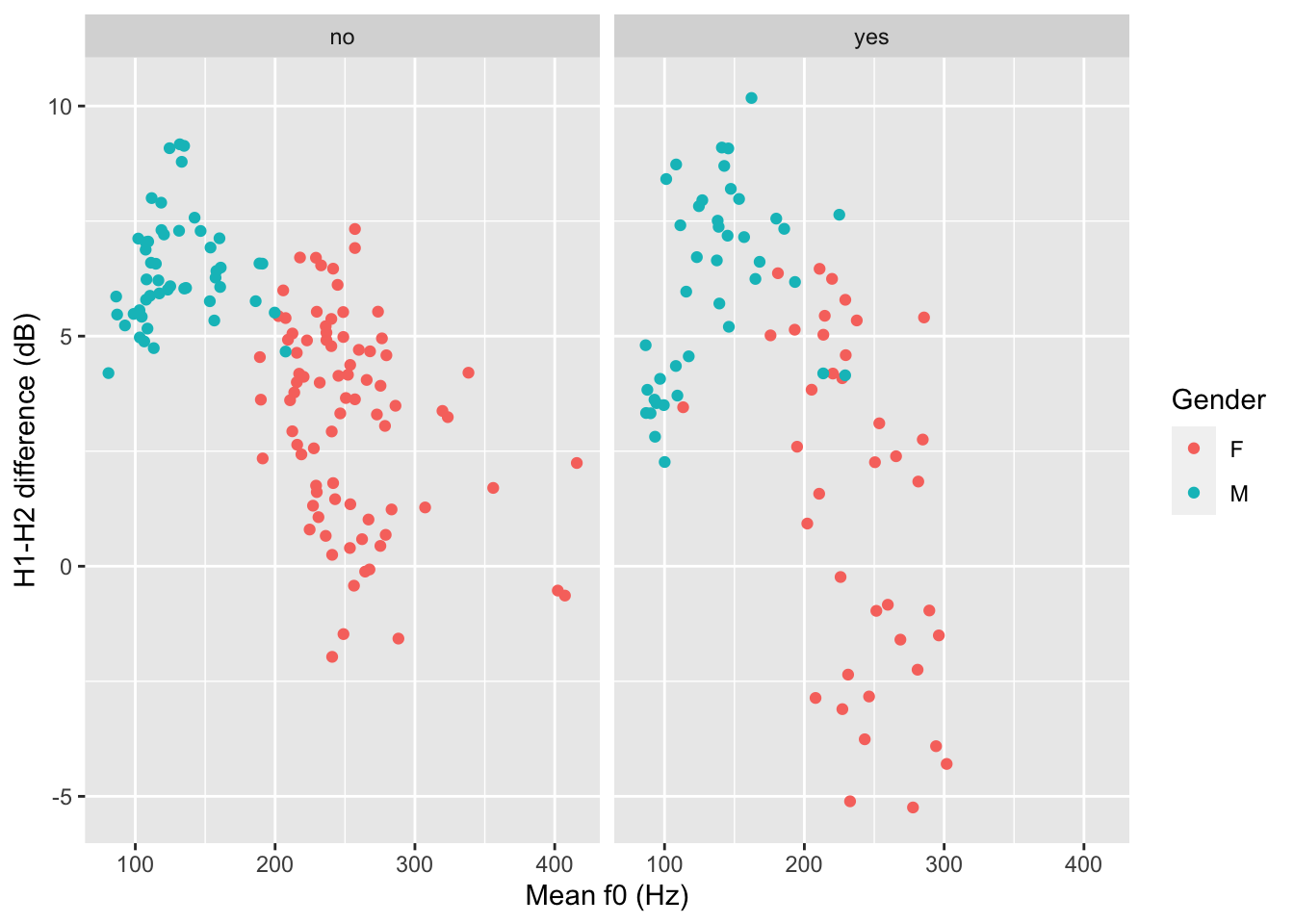
You could write a description of this plot like this:
Figure 8 shows mean f0 and H1-H2 difference as a scatter plot. The two panels indicate whether the participant was a student of music. Within each panel, the participant’s gender is represented by colour (red for female and blue for male). Male participants tend to have higher H1-H2 differences and lower mean f0 than females. From the plot it can also be seen that there is greater variability in H1-H2 difference in female music students compared to female non-music participants. Within each group of gender by music student there does not seem to be any specific relation between mean f0 and H1-H2 difference.
The polite data also has a column attitude with values inf for informal and pol for polite. Subjects were asked to speak either as if they were talking to a friend (inf attitude) or to someone with a higher status (pol attitude).
Recreate the last plot, this time faceting also by attitude. Use the rows column to create two separate rows for each value of attitude.
polite |>
ggplot(aes(f0mn, H1H2, colour = gender)) +
geom_point() +
facet_grid(cols = vars(musicstudent), rows = ...)Now write a description of the plot.