# .rda are R data files and they can be read with `load()`
# `load()` does not need to be assigned to avariable for the data to be added to the enviornment
load("data/coretta2018a/formants.rda")Advanced plotting
Learn a few more tips and tricks for plotting
1 Overview
In this tutorial, you can go through the different sections in any order you like and you can pick and choose which sections you want to work on. Note that you should complete Section 4 because it covers stat_summary() which you need for Exercise 1 of the first summative.
The tutors will be able to help you choose sections that might be useful based on your interests or your dissertation projects (whether you are working on it now or you will next year!).
In this tutorial, there will be less explicit instructions or explanations. Before starting, make sure you attach the necessary packages (like tidyverse).
You can find information on the data in the QM data website or by clicking the “Description” button in each section.
2 Formant data
In this section we will plot formant data from Italian.
The data contains F1 and F2 measurements at 3 points within each vowel. We want to plot the values at the mid-point of the vowel.
formants |>
  ggplot(aes(f12, f22, colour = vowel)) +
  geom_point(alpha = 0.5)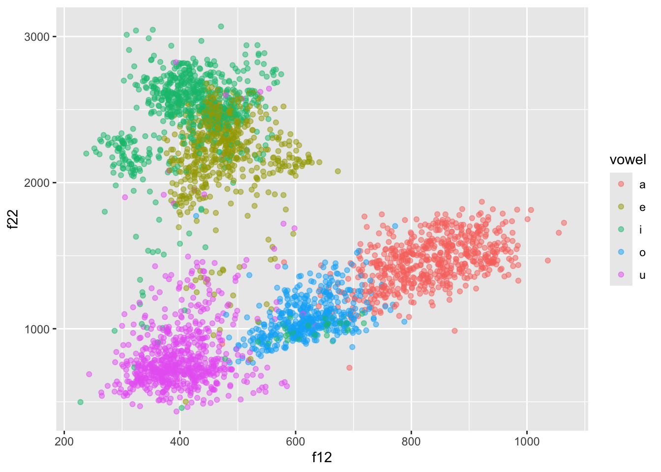
This doesn’t look right though… Shouldn’t /a/ be at the bottom, /i/ on the top-left and /u/ on the top-right?
Let’s fix this! First we need to use f22 as the x-axis and f12 as the y-axis.
formants |>
  ggplot(aes(f22, f12, colour = vowel)) +
  geom_point(alpha = 0.5)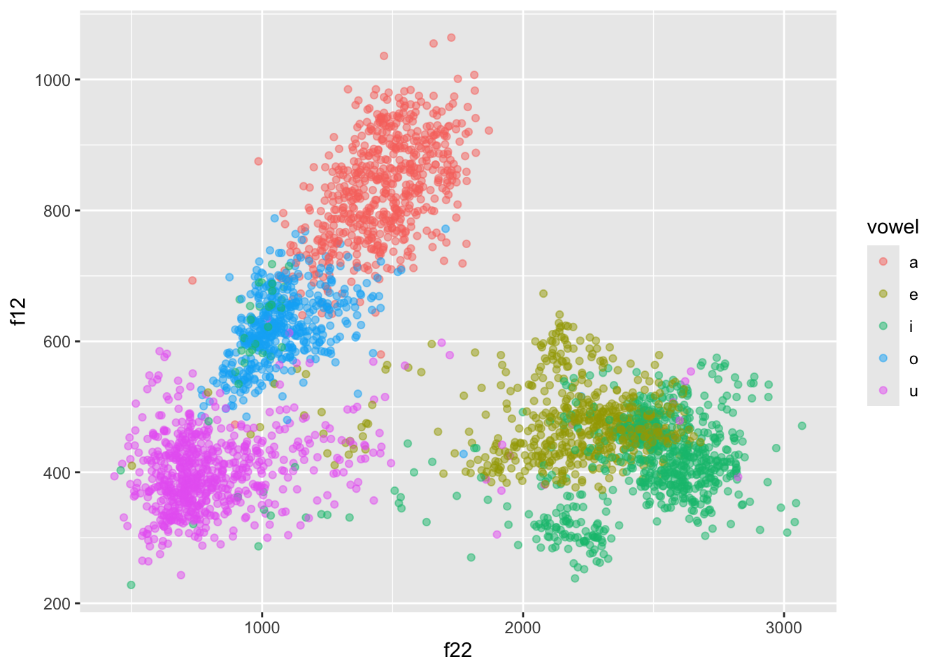
But now the plot is upside-down!
To fix this we need to reverse both axes with scale_*_reverse().
formants |>
  ggplot(aes(f22, f12, colour = vowel)) +
  geom_point(alpha = 0.5) +
  scale_x_reverse() + scale_y_reverse()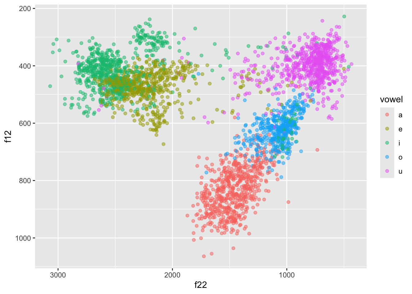
We can do better! Let’s split the data for each participant and let’s plot ellipses (circles) for each vowel.
We can plot speakers separately with facet_wrap(): this works like facet_grid() but instead of specifying variables for rows and columns, you just specify one variable. The data of each value in that variable will be plotted in a separate panel. This is useful when you have many different values for a single variable, like speaker here.
We’re also adding in ellipses around each cluster using stat_ellipse(). If you see test that says Warning: Probable convergence failure, that’s because some ellipses might not fit the data super well. Don’t worry about it for now.
(Note: the plot your code generates will look more squashed than to the one below. If you want to learn how to make your plot taller, like the one below, check out the Extra box below.)
formants |>
  ggplot(aes(f22, f12, colour = vowel)) +
  geom_point(alpha = 0.5) +
  stat_ellipse() +
  scale_x_reverse() + scale_y_reverse() +
  facet_wrap(vars(speaker), ncol = 3)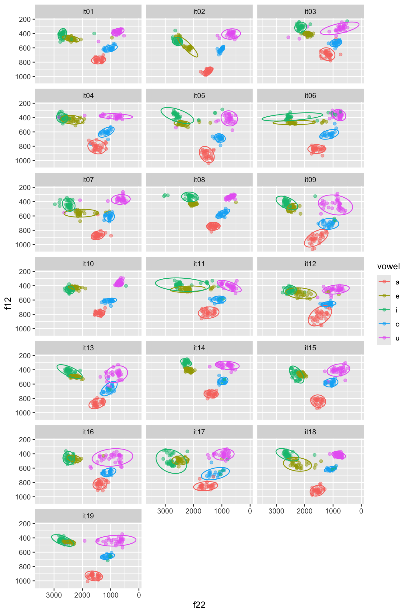
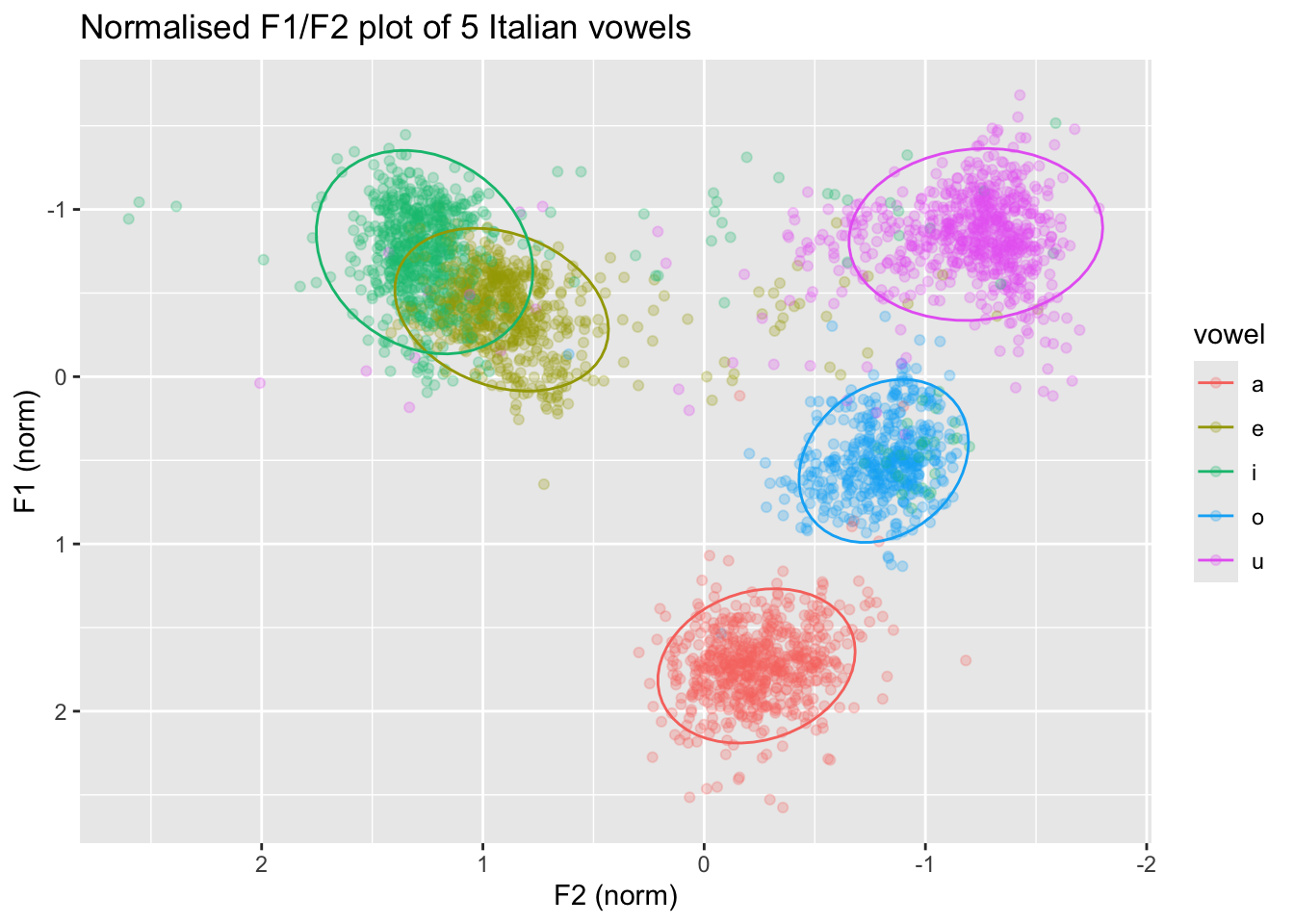
In the plot below, the data is normalised within speakers: note how the numbers along the axis labels are different and the clusters are a bit less dispersed. If you want to learn how to normalise the data within speakers so that you can recreate the following plot, check Section 5 .
3 Reaction times
You have learnt how to use density plots, but an alternative way of plotting continuous data by categorical groups is to use strip charts and violin plots, alone or in combination!
Let’s plot reaction times from the shallow data.
shallow <- read_csv("data/song2020/shallow.csv")Rows: 6500 Columns: 11
── Column specification ────────────────────────────────────────────────────────
Delimiter: ","
chr (8): Group, ID, List, Target, Critical_Filler, Word_Nonword, Relation_ty...
dbl (3): ACC, RT, logRT
ℹ Use `spec()` to retrieve the full column specification for this data.
ℹ Specify the column types or set `show_col_types = FALSE` to quiet this message.You can plot violin plots using geom_violin(). A violin is basically just a density plot, mirrored vertically. The wider parts of the violin indicate a greater density of data around the related y-axis values.
shallow |>
  # we filter to include only the critical trials
  filter(Critical_Filler == "Critical") |>
  ggplot(aes(Relation_type, RT)) +
  geom_violin() +
  facet_grid(cols = vars(Group))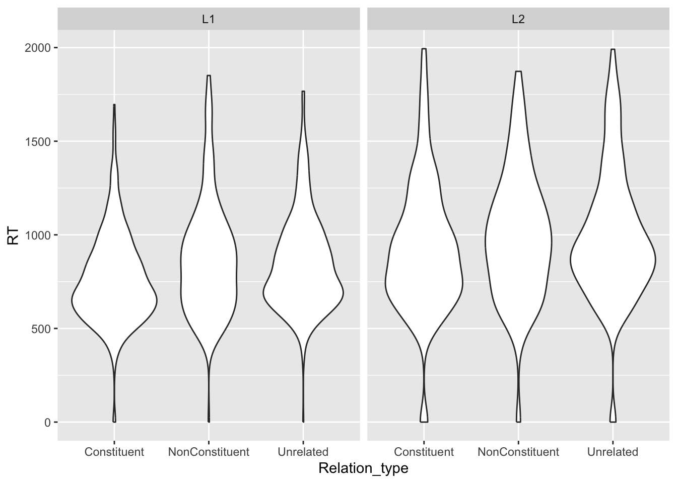
We can overlay a strip chart, which is basically just the raw data, plotted as dots that are jittered horizontally.
shallow |>
  # we filter to include only the critical trials
  filter(Critical_Filler == "Critical") |>
  ggplot(aes(Relation_type, RT)) +
  geom_violin() +
  # the width argument in geom_jitter() specifies how wide the jitter should be, as
  # a value between 0 and 1.
  # the lower the number, the narrower the jitter.
  geom_jitter(width = 0.1, alpha = 0.25) +
  facet_grid(cols = vars(Group))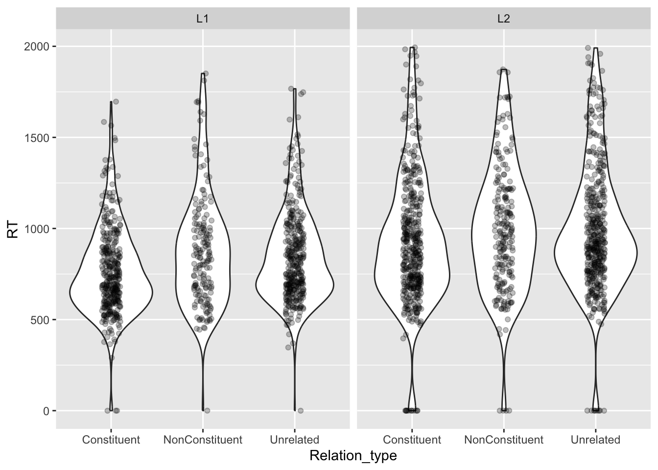
Can you tell if there are differences in RTs between the different groups and relation types?
4 Accuracy and computing proportions
4.1 Koppensteiner 2016
Let’s look at data from Koppensteiner et al, 2016. The study looked at the relationship between sound iconicity and body motion.
takete_maluma <- read_delim("data/koppensteiner2016/takete_maluma.txt")Rows: 460 Columns: 5
── Column specification ────────────────────────────────────────────────────────
Delimiter: "\t"
chr (3): Tak_Mal_Stim, Answer, Rater
dbl (2): Corr_1_Wrong_0, Female_0
ℹ Use `spec()` to retrieve the full column specification for this data.
ℹ Specify the column types or set `show_col_types = FALSE` to quiet this message.The study specifically analysed the accuracy of the responses (Answer) but in this tutorial we will look instead at the response itself (whether they selected a shaking motion or a flowing motion).
Alas, this piece of information is not coded in a column in the data, but we can create a new column based on the available info.
When the stimulus is
Taketeand the answer isCORRECTthen the participant’s response wasshaking.When the stimulus is
Taketeand the answer isWRONGthen the participant’s response wasflowing.When the stimulus is
Malumaand the answer isCORRECTthen the participant’s response wasflowing.When the stimulus is
Malumaand the answer isWRONGthen the participant’s response wasshaking.
Now, go ahead and create a new column called Response using the mutate() and the case_when() function.
We have not encountered this function yet, so here’s a challenge for you: check out its documentation to learn how it works. You will also need to use the AND operator &: this allows you to put two statements together, like Tak_Mal_Stim == "Takete" & Answer == "CORRECT" for “if stimulus is Takete AND answer is CORRECT”.
(If you are following the documentation but case_when() is still giving you mysterious errors, make sure that your version of dplyr is the most current one. To do this, run packageVersion("dplyr") in the console. You want the output to be 1.1.0. If it’s not, you’ll need to update tidyverse by re-installing it.)
You should now have something that looks like this:
takete_malumaA common (but incorrect) way of plotting proportion/percentage data (like accuracy) is to calculate the mean accuracy of each participant and then produce a bar chart with error bars that indicate the mean accuracy and the dispersion around the mean accuracy.
You might have seen something like this in many papers.
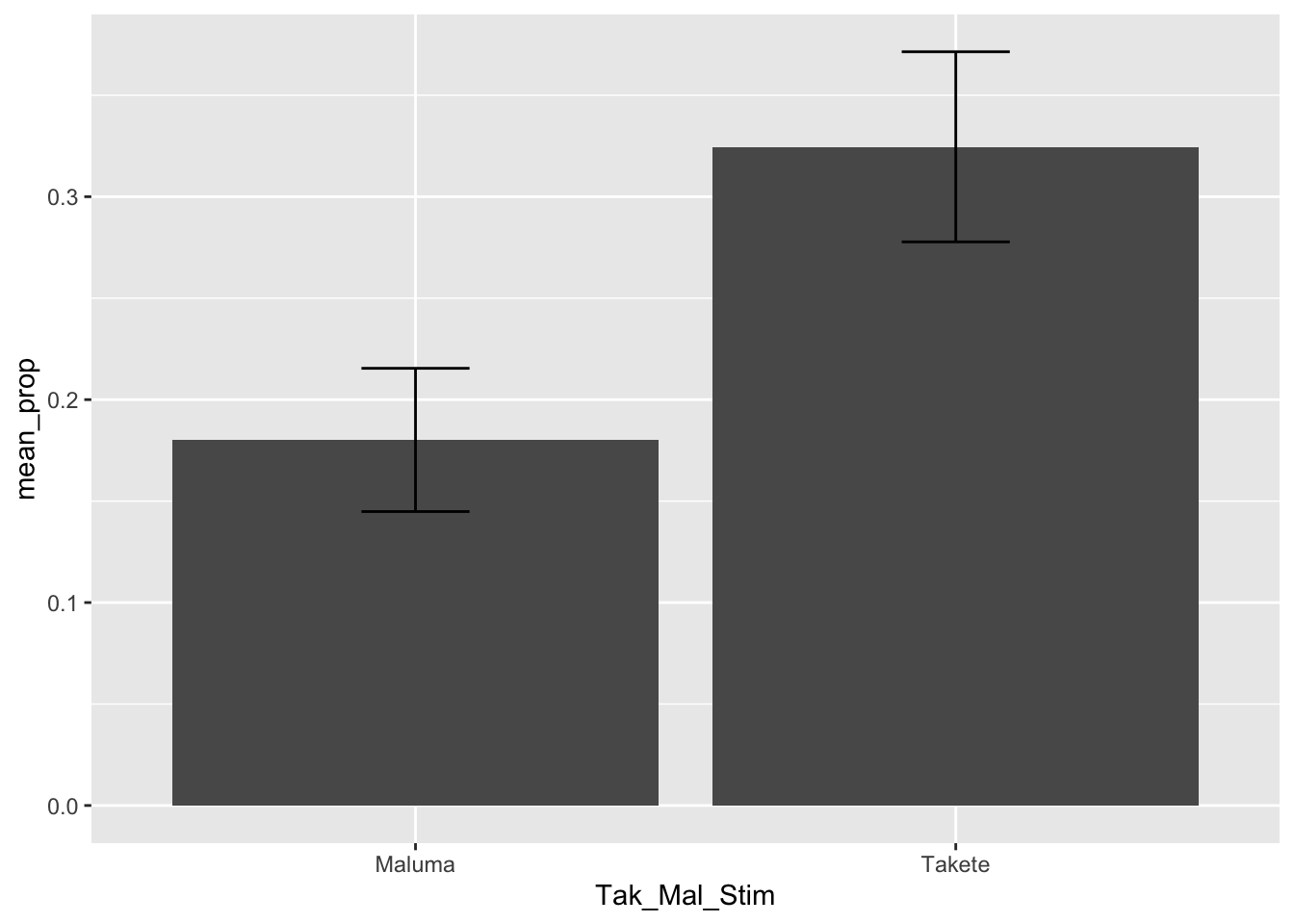
THE HORROR. Alas, this is a very bad way of processing proportion data. Check this blog post if you want to learn why.
The alternative (robust) way to plot proportion data is to show the proportion for individual participants (Rater in the takete_maluma data frame). For example, what percentage of the time did a participant give a “shaking” response?
To do so we can use a combination of summarise(), geom_jitter() and stat_summary().
First, we need to calculate the proportion of “shaking” responses by participant (Rater) with the simple formula: number of “shaking” responses / total number of responses. (Note that you could have well picked “flowing” instead of “shaking”, and that would give you an equivalent but opposite result: if somebody gave 70% “shaking” responses, they must have given 30% “flowing” responses. The most important thing is to be consistent throughout the entire computation.)
To calculate this proportion, we first need to create a new column with a numeric version of the Response column. Since we want to calculate the proportion of “shaking” responses, we use 1 for “shaking and 0 for”flowing”.
We can do that using the ifelse() function.
takete_maluma <- takete_maluma |>
  mutate(
    Response_num = ifelse(Response == "shaking", 1, 0)
  )
takete_maluma
We can use a special tidyverse function, n(), which returns the number of rows in the data frame, or if the data is grouped, the number of rows in each group. Since we will group the data frame by Rater and Tak_Mal_Stim, n() returns the number of rows for each participant and each stimulus!
shaking_prop <- takete_maluma |>
  group_by(Rater, Tak_Mal_Stim) |>
  summarise(
    shaking_prop = sum(Response_num) / n(),
    # The following drops the grouping created by group_by() which we don't
    # need anymore.
    .groups = "drop"
  )
shaking_prop
Why does sum(Response_num) / n() give us the proportion of “shaking” responses? We coded every “shaking” response as 1, so if somebody gave 5 “shaking” responses and 10 “flowing” responses, we would calculate \(5 / (5 + 10) = 5/15 = 33.3\%\).
Now we can plot the proportions and add mean and confidence intervals using geom_jitter() and stat_summary().
Before proceeding, you need to install the Hmisc package. There is no need to attach it (it is used by stat_summary() under the hood). Remember not to include the code for installation in your document; you need to install the package only once.
ggplot() +
  # Proportion of each participant
  geom_jitter(
    data = shaking_prop,
    aes(x = Tak_Mal_Stim, y = shaking_prop),
    width = 0.1, alpha = 0.5
  ) +
  # Mean proportion by stimulus with confidence interval
  stat_summary(
    data = takete_maluma,
    aes(x = Tak_Mal_Stim, y = Response_num, colour = Tak_Mal_Stim),
    fun.data = "mean_cl_boot", size = 1
  ) +
  labs(
    title = "Proportion of takete responses by participant and stimulus",
    caption = "Mean proportion is represented by coloured points with 95% bootstrapped Confidence Intervals.",
    x = "Stimulus",
    y = "Proportion"
  ) +
  # ylim(0, 1) +
  theme(legend.position = "none")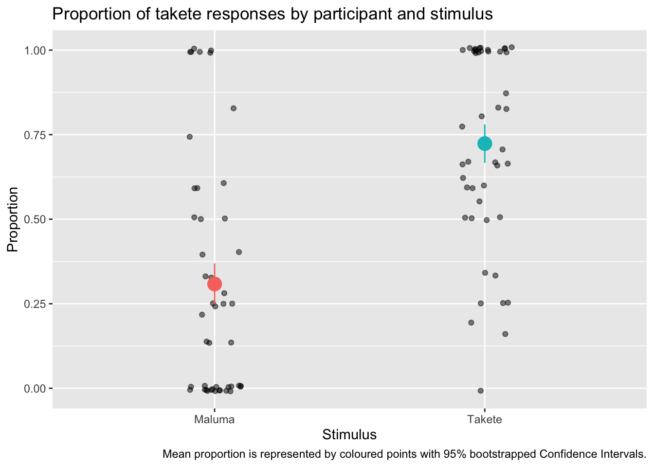
Do you see how much more informative and interesting this plot is, compared to the bar-and-whisker plot above?
You will notice something new in the code: we have specified the data inside geom_jitter() and stat_summary() instead of inside ggplot(). This is because the two functions need different data: geom_jitter() needs the data with the proportion we calculated for each participant and stimulus; stat_summary() needs to calculate the mean and CIs from the overall data, rather than from the proportion data we created.
We are also specifying the aesthetics within each geom/stat function, because while x is the same, the y differs!
In stat_summary(), the fun.data argument lets you specify the function you want to use for the summary statistics to be added. Here we are using the mean_cl_boot function, which returns the mean proportion of Response_num and the 95% Confidence Intervals (CIs, there are frequentist confidence intervals) of that mean. The CIs are calculated using a bootstrapping procedure (if you are interested in learning what that is, check the documentation of smean.sd from the Hmisc package).
4.2 Pankratz 2021
Now let’s move onto data from Pankratz 2021. Since we will need it for the plot, let’s convert SI into a factor and let’s log freq (check Regression models: interactions between numeric predictors for more details).
si <- read_csv("data/pankratz2021/si.csv") |>
  mutate(
    SI = factor(SI, levels = c("no_scalar", "scalar")),
    logfreq = log(freq)
  )
si
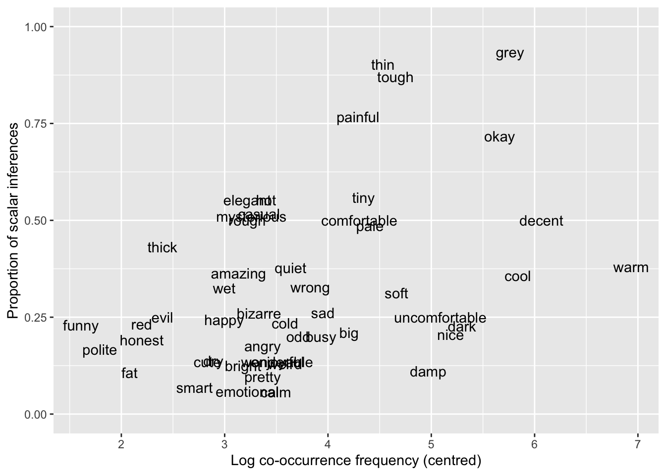
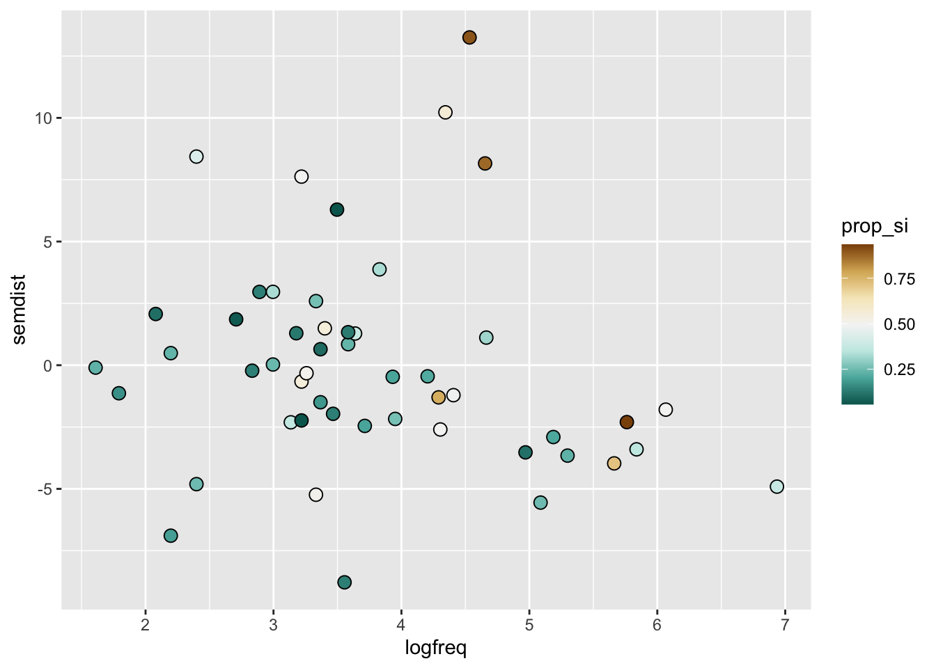
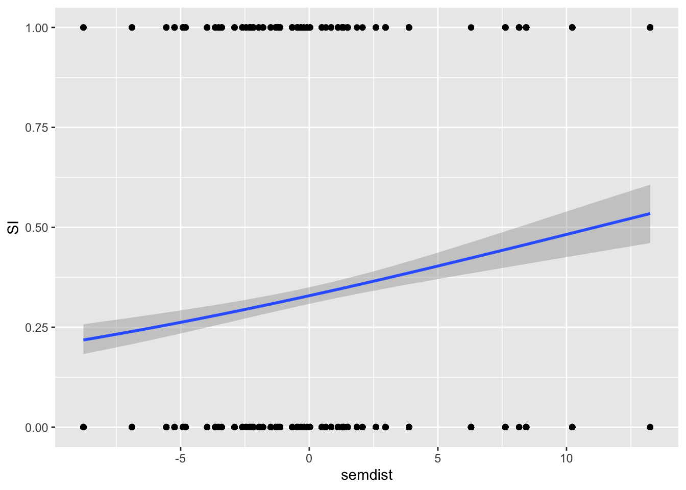
Let’s plot the proportion of scalar inferences as a function of log frequency and as a function of semantic distance.
The variable SI is binary: no_scalar if a scalar inference was not made, scalar if it was. We like to visualise binary outcomes as proportions on the y-axis and centred log frequency on the x-axis.
We need to apply the same trick as we did with the Koppensteiner 2016 data. SI is categorical, but we want to show the proportion of scalar vs no_scalar across values of centred log frequency. We can achieve this by temporarily converting SI to a numeric variable and subtract 1, and then using geom_smooth() with a binomial family (which will indicate the proportion of scalar responses), like so:
si %>%
  mutate(SI = as.numeric(SI) - 1) %>%
  ggplot(aes(log(freq), SI)) +
  geom_point() +
  geom_smooth(method = "glm", method.args = list(family = "binomial"))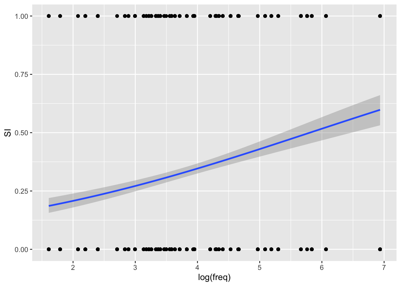
The function as.numeric() works with factors by converting each level into a number: try as.numeric(si$SI) to see what it does. Then, we subtract 1 so that 1 becomes 0 and 2 becomes 1.
The plot suggests that there is a somewhat positive relationship between centred log frequency and probability of the participant making a scalar implication. In other words, the higher the log frequency, the higher the probability of a scalar implication.
Now it’s your turn! Reproduce the following plot.
5 Fundamental frequency (f0) and normalisation
# .rda are R data files and they can be read with `load()`
load("data/coretta2018a/formants.rda")
Let’s plot f0 for different vowels: We can use a violin plot with a strip chart (see previous section!).
formants |>
  ggplot(aes(label, f0)) +
  geom_violin() +
  geom_jitter(width = 0.1, alpha = 0.1)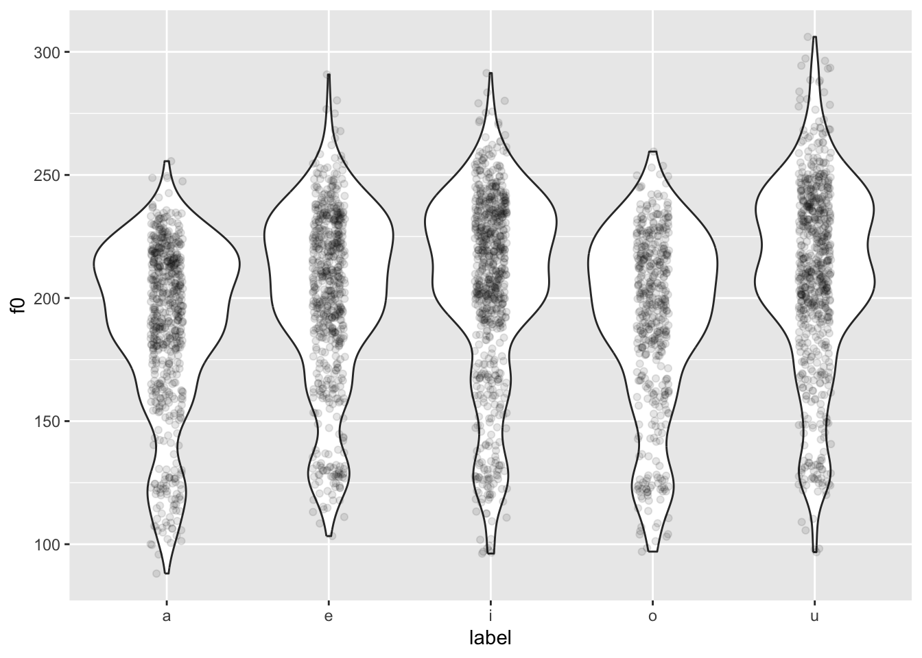
You might notice something weird going on… The violins are quite bumpy! This is because different people have different mean f0.
We want to normalise the data across speakers, so that individual differences in mean f0 are removed. This process is also called standardisation or z-scoring.
Z-scores are a standardised unit that allows you to compare things that are on different scales. Our f0 values are on different scales because some speakers have higher mean f0, some have lower mean f0.
Z-scores are calculated by removing the mean from each value and dividing it by the standard deviation. Since we are normalising within subject, we need to calculate the mean and standard deviation for each participant and apply those to each participant’s data separately. We achieve this by grouping the data by speaker, and then creating a new column that contains each speaker’s z-scores.
formants <- formants |>
  # group data by speaker so that normalisation is applied for each speaker
  # separately
  group_by(speaker) |>
  # calculate z-scores
  mutate(
    f0_z = (f0 - mean(f0)) / sd(f0)
  )

head(formants$f0_z)
[1] 3.4126740 -0.9289615 1.1254401 -0.5180812 -1.0111376 0.2488954Now we can recreate the plot above but using f0_z.
formants |>
  ggplot(aes(label, f0_z)) +
  geom_violin() +
  geom_jitter(aes(colour = vowel), width = 0.1, alpha = 0.1)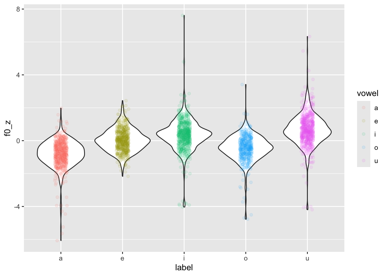
Now the distributions are a lot less lumpy!
Why is colour = vowel in geom_jitter(aes(...))? Because we want to colour only the jittered points. If we put colour = vowel in the main ggplot(aes(...)) , then the violin borders would also be coloured.
If you want to colour the areas of the violins instead, you can use the fill aesthetic. This will work both in the main ggplot(aes(...)) or in geom_violin(aes(...)) because the points of geom_jitter() can’t be given a colour fill, but only a colour.
6 Rating (Likert) scales
Likert scales are a kind of rating scales (see here for more on the relationship between them). Such scales produce very strange variables. They are categorical and ordinal.
Despite being very common, the practice of treating Likert scales as numeric is quite inappropriate. For an explanation, check the first two pages of Verissimo (2021).
A very nice type of plot that is very useful for Likert scale data is a so-called divergent stacked bar chart.
The HH package has a few handy functions to make creating divergent stacked bar charts very straightforward. You will have to install this package (remember not to include the code for installation in your document; you need to install the package only once).
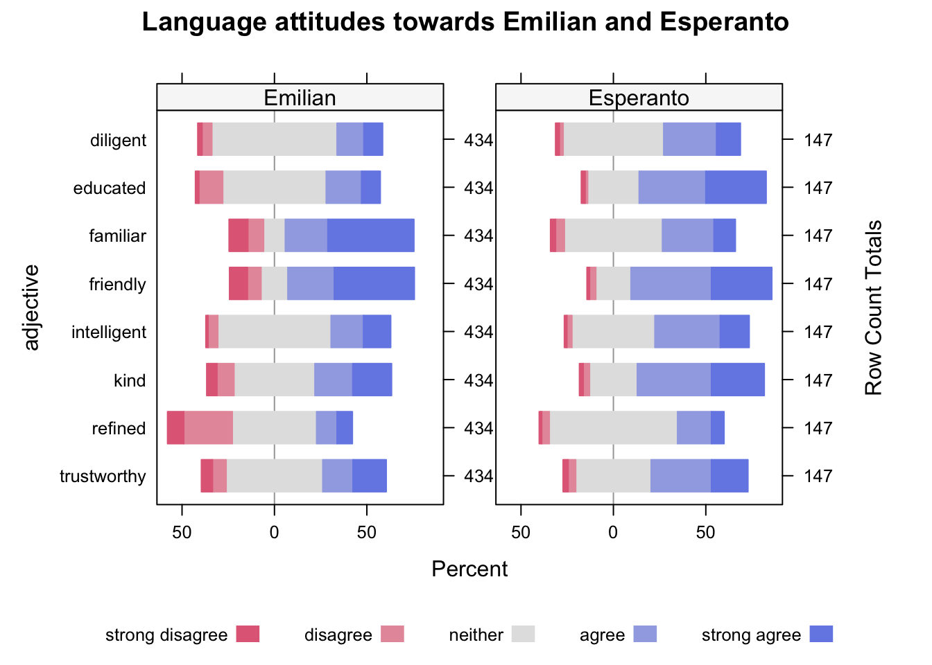
We will create a plot of language attitudes towards Esperanto and Emilian (Gallo-Italian).
Participants were asked the following: “when you hear somebody speaking Emilian/Esperanto, you would think they are…” and they were presented with 9 adjectives, which they had to rate from strongly disagree (meaning they strongly disagreed that somebody speaking Emilian/Esperanto had that quality) to strongly agree (meaning they strongly agreed that the person had that quality). Esperanto speakers rated Esperanto while Emilian speakers rated Emilian.
Let’s read the data (it’s an .rds file!).
emilianto_attitude <- readRDS("data/hampton2023/emilianto_attitude.rds")Install the HH package before proceeding (but you don’t need to attach it).
To be able to plot with the likert() function from the HH package, we first need to wrangle the data.
Basically, we need a new tibble with counts of each value of the scale for each of the adjectives that participants had to rate. In other words, how many times did people say “strong disagree”, “disagree”, and so on, for each adjective.
Make sure you understand each line of the following code.
emilianto_lik <- emilianto_attitude |>

  # let's select only the columns we need
  select(language, educated:familiar) |>

  # let's pivot the data so that we get a longer tibble, with the columns
  # language, adjective and score
  pivot_longer(educated:familiar, names_to = "adjective", values_to = "score") |>

  # and we count the numbers of each adjective and score combo
  count(language, adjective, score) |>

  # then we pivot again so that now the data is wider, with the columns,
  # language, adjective, and one column for each of the five scores
  pivot_wider(names_from = "score", values_from = n) %>%

  # we rename the scores to the actual label that the participants saw
  rename("strong disagree" = `1`, "disagree" = `2`, "neither" = `3`, "agree" = `4`, "strong agree" = `5`)
emilianto_lik
Now we can finally plot this using the likert() function. The function takes a formula that describes how to plot the data: here, we want a divergent stacked bar for each adjective and we want all the scores (adjective ~ .), but we also want to facet by language (| language).
HH::likert(
  # formula
  adjective ~ . | language,
  # data
  emilianto_lik,
  as.percent = TRUE,
  # plot title
  main = "Language attitudes towards Emilian and Esperanto"
)
What is that HH::likert()? That’s the R way of calling a function from a package directly, without the need to attach the full package with library(HH). This is useful, for example, for packages that override functions from other packages when attached or for packages that attach a lot of package dependencies.
In most cases you won’t have to worry, but if you ever think that function overwriting is causing issues, you know you can use the package::function() syntax.
What can you tell about the attitude towards Emilian and Esperanto from the plot?
